Disclaimer #1: This is meant to be a “living document.” While I can imagine maybe reaching an “endpoint” for it someday, it is meant to be a framework that I fill in and add to as time allows. So, stop by often! In the meantime, expect sections to come and go, to be empty, or to be “under construction.”
Disclaimer #2: I am not some “certified R Shiny Expert”–just a guy who likes Shiny, uses Shiny for work most days, and wishes there were better, more comprehensive, cross-cutting, and accessible references for Shiny. I can confirm that, at time of writing, every line of code provided in this document worked, but I cannot promise that my examples represent the “best” way to do anything. There are often many valid ways to achieve the same thing, and “best” can be relative.
I also can’t promise that my code examples won’t break over time as the packages they rely on continue to develop. If you notice something broken, please tell me and I will fix it! Lastly, I would not consider myself well-versed in the plotly package, in particular, but I think understanding it at a basic level is valuable, so I present what I do know here as a starting point.
Disclaimer #3: I regularly use ChatGPT as a “sounding board,” both on my real R Shiny projects and while writing this manual. However, >99% of what you will read here is my own original writing and code. Where I have used something from ChatGPT more or less in full, I A) state as much at that point in the manual and B) have confirmed that it works and makes sense.
Lastly, there is no way to make a truly comprehensive R Shiny “manual” (arguably, one already exists). Instead, this post is a compendium of everything I actually use how I actually use it, and it’s organized in roughly the order I wish I had learned it all in.
This post uses “FAQ formatting.” Below, you’ll find six core sections. In each, there will be a series of guiding questions. For each of these, there will be a text answer, example code (usually), and images or GIFs for demonstration (usually). Use the Table of Contents below to navigate to a specific question!
- You’ve Gotta Start Somewhere…
- How do I set up a project folder for an R Shiny App?
- What other files/folders should I create for a new R Shiny App project?
- What is the minimum code needed to get a Shiny app to launch?
- How should I lay out my App? (AKA “skeletonization”)
- How do I keep my App manageable? (AKA modularization and functional programming)
- How should I refer to files in my app?
- How do I change what my app looks like? (AKA aesthetics)
- Where should I host my app?
- Core Concepts
- How do I display an element in my app? (aka render* and output* functions)
- How do I catch inputs from my user? (aka *Input() functions)
- How do I make my app respond to user actions? (aka reactive contexts, part 1)
- How do I keep my app from responding to user actions? (aka isolation)
- How do I have my app respond to user actions in more sophisticated ways? (aka observation and reactive contexts, part 2)
- How do I keep my app running smoothly as users interact with it? (aka creating a logical reactivity map)
- How do I keep track of things that can change while my app is running? (aka reactive values and reactive expressions, part 3)
- How do I show, hide, enable, or disable something in my app?
- How do I add a “loading symbol” to my app? (aka waiters and spinners)
- But no, really, how do I make a progress bar?
- Interactive Map Widgets Using the leaflet package
- Interactive Tables Using the DT package
- Interactive Plots Using the Plotly package
- What if I already know ggplot2 and don’t want to learn another graphing package?
- How would I create a basic plotly graph (assuming I already know ggplot2)?
- How can users interact with plotly graphs by default, and how do I control these interactive elements?
- How do I update a plotly graph that already exists?
- What kinds of user actions can I watch and respond to for myplotly graphs?
- Other cool things worth knowing
You’ve Gotta Start Somewhere…
How do I set up a project folder for an R Shiny App?
Answer: While an R Shiny App can be written entirely in one file (by convention called “app.R”) or in two files (by convention called “server.R” and “ui.R”), I recommend (at least) three files. By convention, let’s call these “global.R,” “server.R,” and “ui.R.” Using these exact file names (including being in all lowercase) has a big advantage, so I highly recommend that you use them!
- Put all code needed to display and organize your UI (short for user interface, AKA what your users see and interact with) in your ui.R file.
- Put all code needed to create UI elements and handle user interactivity in your server.R file.
- Put all code that needs to run just once and isn’t Shiny-specific (e.g., function-building code, library() calls, loading datasets, etc.) in your global.R file (this file is called “global.R” because it should set up anything needed in the App’s “global environment” upon startup).
Put these three files inside a single project folder (from here on, the “root” folder). Then, make your root folder into an R Project folder. In R Studio, go to File–>New Project–>Existing Directory, then use the File Picker to select this folder, then click Create Project. From then on, to work on your App, launch R Studio using your .Rproj file or else by loading that file by going to File–>Open Project.
Heads up! I recommend you make (or clone) this folder in a Google Drive (or equivalent) directory for automatic backup and version control (using Github for version control would be even better, especially if you intend to share your code or collaborate on it with others. However, use of Github will be outside the scope of this post).
To avoid a common source of errors, you may also need to change one of R Studio’s default settings. Go to Tools–>Global Options–>General pane, Basic Tab. Find the option “Save workspace to .RData on exit” and change the option in the drop-down menu to “Never.” This will clear your global environment each time you close R, ensuring that you never develop a portion of the app that depends on an object that exists only in your session’s global environment but isn’t in your app’s global environment. Don’t worry if you don’t know what that means; just know you don’t want it to happen!

What other files/folders should I create for a new R Shiny App project?
Answer: While the files listed in the previous answer are the minimum, several more are strongly encouraged:
- In your root directory, create a folder called “www.” Among other possibilities, use this folder to store CSS files (see below), media files (such as images), and custom font files that your app will use. This folder is practically essential for all but the simplest of Shiny apps.
- In your root directory, create a folder called “inputs.” Use this folder to store any input files (e.g., data sets) your app needs. You might assume here that you would also need an “outputs” folder. However, depending on where your app is hosted, it may not be given “write permissions” (i.e., it may not be allowed to write files to disk permanently). Also, many R Shiny hosting platforms will regularly restore an app’s folder structure to its original contents every time the app closes. For these reasons, don’t count on generating output files from your App unless you “train” your app to “ship” them somewhere else (see Section Six in this post).
- In your root directory, create a folder called “Rcode.” Use this folder to store R script files for each modularized element in your app (see later question in this section) as well as any R code you may want to source in your global.R file rather than write there (e.g., building a complex function).
- In your www folder, create a text file with a .css file extension. You can make one in R Studio by going to File–>New File–>CSS File. Use this file to write CSS (Cascading Style Sheets) code for your app (see later question in this section).


What is the minimum code needed to get a Shiny app to launch?
Answer: This depends a little on whether you have a one-file, a two-file, or a three-plus-file app structure. No matter what, though, we will always need three things:
- A library(shiny) call to load the R Shiny package.
- The creation of a UI object.
- The creation of a server function.
Additionally, we may need a call to the shinyApp() function, depending on our setup. Note that while the UI of our app is a “regular-old R object,” our server is a function, complete with required inputs. This is a subtle but important distinction and reflects the fact that while the UI of our app just sort of “exists,” our server has to do things and thus needs inputs, outputs, and operations like any other R function would (if objects are nouns, functions are verbs).
Understandably, a single-file app requires that all these things be in the same file called app.R (unless you have a very good reason to call it something else):
#One file app structure

library(shiny)

# Define the UI
ui <- bootstrapPage( #Or any other div-style HTML container.
#Any UI elements.
)
# Define the server
server <- function(input, output, session) { #These three inputs are required!
#Any server elements
}

# Actually initiate and launch the app. Notice, it requires the same inputs as the server function.
shinyApp(ui = ui, server = server, session = session)
A two-file app looks similar except that the ui and server components are in separate files. By convention, these are called ui.R and server.R. Additionally, the library(shiny) call will be needed in both files (since both files will need access to the tools available in that package). In general, this will be true for any package that has both UI and server components your app takes advantage of. This is why I generally don’t like two-file app structures; it makes managing packages more of a chore.
If you follow convention and name your app files ui.R and server.R (and store them both in your project folder), you won’t need the shinyApp() call to launch your app–R Studio will recognize either file as part of a Shiny app and provide you with a “Run App” button in the R Studio script pane to launch your app. By contrast, even if you name a one-file app file app.R, you will still need the shinyApp() call in your script to receive the “Run App” button.
A three-file app looks exactly like a two-file one except that the library(shiny) call can go in the global.R file only (along with any other packages needed!), assuming you have followed naming conventions for all three files. You will also get a “Run app” button when viewing the global.R file as well. This is why I prefer the three-file setup.
How should I lay out my App? (AKA “skeletonization”)
Answer: Because the internet is now integral to modern life, most users have expectations about how a webpage “should” look and behave we should strive to meet.
One expectation is that a site will have a relatively static “skeleton.” That is, elements on our webpage will have distinct “homes,” and these homes should not (generally) move around too much, grow or shrink unpredictably, or suddenly pop into or out of existence. This expectation requires that we:
- Identify all the elements that will occupy our webpage, even ones that may come and go depending on what our users are doing.
- Reserve and build “home spaces” for each.
- Size these “homes” so they will comfortably fit their eventual contents no matter what.
- Demarcate these homes to make them distinctive and separate them from those of their neighbors.
- Fill these “homes” with placeholders if their usual contents ever “go missing.”
The latter three bullets are best accomplished using CSS (see later question in this section), and the first bullet should be completed (as best as possible) prior to starting app development.
The second bullet, meanwhile, benefits from applying some “HTML thinking,” which is largely beyond the scope of this post. For a more thorough introduction, I highly recommend Head First HTML and CSS by Elisabeth Robson and Eric Freeman. It’s the most readable and enjoyable coding book I have ever encountered! It’ll leave you well-prepared to think like an HTML/web programmer.
However, the basic idea is to create one’s app out of one (or more) page(s). Each page is a box, and inside each page-box is one or more additional boxes (what a web develop might call a div, which is just short for “divider”).
Within a page, the boxes should have a natural “flow” from left to right and top to bottom. If your content is suitable, rows and columns can be created by nesting boxes inside of other boxes as needed. The “flow” part matters if your user has a narrow screen (e.g., is on a cell phone in portrait mode) because elements that would normally fit side-by-side on a wide screen will usually instead be arrayed top to bottom on a narrow one.
R Shiny has many built-in “shortcut” functions for creating boxes (e.g., fluidPage() for creating a page-sized box, fluidRow() for creating a row-like box, and column() for creating a column (really, a cell) within a row). If you want to keep things simple, just use these R Shiny shortcut box functions to lay out your app. See here for details. Just know that these Shiny boxes are “opinionated” in the sense that they come with some automatic behaviors and stylings you may find annoying and also hard to change!
However, R Shiny also has a div() function for creating basic HTML divs; using divs to layout a Shiny App UI is often just as easy as (if not easier than) using R Shiny’s custom box functions for apps of medium-to-high complexity (fluidRows, columns, fluidPages, etc. are all just divs under the hood anyway!).
Either way, imagine your app as a series of nested boxes, then add the corresponding div structure to your ui.R file as one of your first coding actions. Later, when you add UI elements, you can slot them into their appropriate “box,” and you’ll already know where that is.
library(shiny)

#The UI of this example App exists in one "page-box," created using "div()".

ui = div(

  #Then, we nest boxes inside our div. First, though, we use a little "inline" CSS code to designate our page-box as a "table," which will allow us to put rows and columns inside it. It would be better to keep this CSS code in a separate CSS file, but I include it here to make this example self-contained.

  style = "display: table;",

  #For each "row," we make a box and designate it a "table row." Here, we'll have two rows with two columns each inside of them.

  div( #First row
    style = "display: table-row;",

    #Putting columns inside of rows effectively creates "cells," so we say as much via CSS. The rest of the CSS code here is just stylistic.

    div( #First column

      style = "display: table-cell; color: red; padding-right: 50px; padding-bottom: 50px;",
      HTML("I'm in Row 1, Column 1!") #Contents of this box.

    ),
    div( #Second column--from here on, everything is the same as above more or less.

      style = "color: green; display: table-cell;",
      HTML("I'm in Row 1, Column 2!")

    )
  ),

  div( #Second Row
    style = "display: table-row;",

    div( #First column

      style = "color: blue; display: table-cell; padding-right: 50px; padding-bottom: 50px;",
      HTML("I'm in Row 2, Column 1!")

    ),
    div( #Second column

      style = "color: purple; display: table-cell;",
      HTML("I'm in Row 2, Column 2!")

    )
  )
)

#No server elements.
server = shinyServer(function(input, output, session){
})

#Run the app
shinyApp(ui, server)

How do I keep my App manageable? (AKA modularization and functional programming)
Answer: R Shiny apps can get complex! Once they get above a certain complexity level, one may require hundreds or even thousands of lines of code. Poor organization can make the code impenetrable to collaborators, not to mention to yourself when something needs fixing!
As such, I recommend modularizing your app if you expect it to get large. To do this, take each major, interactive element (a map, a set of user inputs, a searchable table, etc.) and create two new, separate R script files for it, one for the UI code needed to create it and the other for the Server code needed to create it. Save both files in the Rcode folder (you can use subfolders for each module or for UI vs. server module files, if you prefer).
In the UI code file for a specific element, you will wrap the entire code needed to make the UI components of the element in a custom function with a name of your choice and no inputs. For example:
#Example--A mapUI.R module file creating the UI components of a map element.
mapUI = function() {
#Your UI-generating code here--whatever would have otherwise gone in the main ui.R file.
}
Then, in your server code file for a specific element, you will do the same except your custom function will have three inputs: input, output, and session. For example:
#Example--A mapServer.R module file creating the server components of a map element.
mapServer = function(input, output, session) {
#Your server-generating code here--what would have otherwise gone in the main server.R file.
}
Then, in your app’s main ui.R file, wherever you wish to put a specific element, add a call to your element’s UI function instead. For example:
#Example--plugging in our UI map module in our main ui.R file.
ui = div(

mapUI() #Calling this function tells R to run every operation inside the mapUI function, and those operations will create the UI elements that should go here.

)
Similarly, in your app’s main server.R file, add a call to your element’s server function, providing the required inputs. For example:
#Example--plugging in our server map module in our main server.R file.
shinyServer(function(input, output, session) {

mapServer(input, output session) #Calling this function tells R to run every operation inside the mapServer() function, and those operations will create the server elements that should go here, which will be reactively dependent on the input, output, and session objects created while the app is running.

})
Lastly, in your app’s global.R file, source the module files for the specific element so those two functions exist in the app’s global environment when it starts up:
#Example--in global.R, sourcing our module map function R scripts.
source(mapUI.R)
source(mapServer.R)
I know that all sounds like a lot, but it will impose a very helpful amount of order over the structure of your app that will make enhancing and debugging the app much easier down the line–unless your app is very simple. Whenever you want to modify or fix a specific portion of your app, you will (generally) need to consider just the code files generating that element. Meanwhile, your main ui.R file can be reserved for easy-to-modify elements like pictures and text, and your main server.R file can be reserved for things like managing interactions between modularized elements. Tidy!
Also, it’s best practice in any programming project to “only do something once.” If there is an operation you need R to consistently perform more than once (such as filtering a data set by a common set of columns), consider writing a custom function to do those operations. Either include the code needed to assemble this function in your global.R script or else save it in a separate R script file, put that file in a “functions” subfolder inside the Rcode folder, and source it in the global.R script.
#Example--creating a custom function in our global.R file.
#If you've never built your own R function before, it's time to learn!
#Below, we create a custom function called filterFunc1(). It takes four inputs (called parameters): a dataset and then a color, smell, and taste value. It then filters the provided data set to only rows with color, taste, and smell values matching those provided when the function is called.
#When creating functions, inputs the function should expect go inside the parentheses of the function() call, separated by commas. Operations the function will do on those inputs go inside the curly braces. return() specifies what the function should produce as output.

library(dplyr)
filterFunc1 = function(color, smell, taste, dataset) { #"color," "smell," "taste," and "dataset" become nicknames for the inputs that we can use to refer to those inputs inside the function's operations.

#This uses "dplyr syntax." Ignore the details here if this format is unfamiliar to you.
newdataset = dataset %>%
    filter(FoodColor == color, FoodSmell == smell, FoodTaste == taste)

return(newdataset)
}
There are two big advantages to this approach. First, if your operations are complex and lengthy, that lengthy and complex code shows up in only one place, not several. That means less to sift through later!
Second, if you ever need to adjust how those operations behave, you can make the changes in a single place and know those changes will apply everywhere. The alternative is having to track down and “fix” every instance of those operations in your code and hope you did so successfully!
How should I refer to files in my app?
Answer: Using relative paths. An R Shiny App should be a “self-contained universe.” Everything needed to start up the app should exist inside of its root folder, and it also shouldn’t matter what computer that folder happens to be on–you should be able to share the project folder with anyone and they should be able to run it. (Caution! One exception here is if your app needs to authenticate, such as if it needs to access a private Google Drive folder–see Section Six of this post.)
To achieve this, we need to source/load files using only relative paths. A path is an “address” for a file so that, when asked to find that file, a computer knows how it should go looking for it. Paths come in two flavors:
- An absolute path is the exact folder-chain to a file on a specific computer (or in a specific drive), starting from the highest-possible folder in that computer/drive. An absolute path might look something like this: “H:\Shared\Computation\Code\R Shiny App Blog Demo Stuff\Example Shiny App\www\my app.css”. It starts all the way up at the H drive and drills down all the way to the specific file.
- A relative path is also the path to a file, but one that assumes the computer can start its search for that file in the folder containing the file that references the path. For example, if your global.R file contains the line “read.csv(“mydataset.csv”)”, R will interpret “mydataset.csv” as a relative path–it will assume it should look for that file in the same folder that the global.R file is in.
In a relative path, subfolders are represented with forward slashes (on Windows, anyway! Sorry Mac folks–I’m not totally sure how paths work there. I assume it’s the same…). So, to refer to your CSS file, you might type “www\mycss.css”. Notice that no forward slash is needed at the beginning.
In a relative path, you can go “up” to a “parent” folder by putting two periods and a forward slash at the front of the path. For example, to refer to your global.R file from a file inside your Rcode folder, you might type “..\global.R”.
You can even go up, over, and then down again in a relative path. For example, to refer to a file in your inputs folder from your Rcode folder, you might type: “..\inputs\mydataset.csv”. This has the computer go up to your root folder from your Rcode folder, over and down into your inputs folder, and then find the specific file there.
By default, you should assume your app will treat your root directory as “home base” for all relative paths. Changing working directories inside of an R Shiny app can create a whole host of problems and should be avoided.
If this section made no sense to you, you might consider looking on the web for a basic guide to relative vs. absolute paths–these are key concepts to understand if you will be doing any amount of programming!
How do I change what my app looks like? (AKA aesthetics)
Answer: Using CSS. If HTML is the programming language of the “structure” of web pages, and if JavaScript is the programming language of the “behavior” of web pages, then CSS is the programming language of the “look and feel” of web pages.
R Shiny is basically just a way of writing website code (that is to say HTML, CSS, and JavaScript) using R-like code instead. R just translates your R-like code into HTML, JavaScript, and CSS behind the scenes so you don’t need to know those languages. However, R Shiny doesn’t really touch “aesthetics” by default nearly as much as it does the other two languages; if you want to change how your app looks and feels (beyond the very basic default styles of things, anyway), you will need to write some CSS code.
Covering CSS in depth is largely outside the scope of this post, though I’ll mention it in relation to specific problems many times throughout. For a more thorough introduction, I highly recommend Head First HTML and CSS by Elisabeth Robson and Eric Freeman. However, I also highly recommend just poking around on the CSS page at W3School.com. It’s a comprehensive resource covering everything you can do with CSS and basically how to do it.
The good news is that, as programming languages go, CSS is very easy to learn, relatively speaking. It has a fairly specific and narrow set of operations it can do, and it also has very barebones and orderly syntax–if you can learn R, you can absolutely learn CSS! Here are the very basics of CSS to get you started:
- Every component of a webpage is contained inside of an HTML element (formally called a “tag”). Tags look like this: <div> … </div>. <div> elements are boxes that hold stuff, <img> elements hold images, <a> elements hold links, etc. HTML tells a web browser what goes where on a webpage through its arrangement of (nested) tags. It’s the beams and girders and rooms and pipes of the skyscraper, so to speak.
- Every tag can be made a member of one or more classes. Think of these as “friend groups” that can be made to share certain traits.
- Beyond a class, every tag can also have a unique ID, one that applies only to that tag. IDs and classes aren’t mutually exclusive; an element can have an ID, one or more classes, none of the above, or a combo.
- Here’s how CSS basically works: When you want to change the look and feel of just one specific element of your app, we can point to it in our CSS code using its ID. If we want to change the look and feel of a group of related elements, we can point to that group using its class. If we want to change the look and feel of every element of a specific tag type (all divs, all imgs, all links, etc.), we can point at that element’s tag name in our CSS code.
- To do any of these things, we write a CSS “rule.” A rule has a few parts.
- The first part is the tag/class/id of the object we’re trying to point at. We call this part the “selector” because we’re selecting our target for our changes. If you want to apply the same changes to multiple targets, you can list multiple targets in your selector, separating them from each other with commas.
- Then, we need a set of curly braces (these things –> {}).
- Inside the braces, we put the name of the property that we are trying to change, followed by a colon.
- Then, we put the value we want to set that property to, followed by a semi-colon. If you are ever having trouble getting your CSS code to work, double-check your punctuation first!
- If we want to change multiple properties, we can list them all inside the braces, one property-value pair per line.
This all looks something like this:
/* This is what a comment looks like in CSS */
/* A rule of CSS code has multiple parts: a selector, braces, and one or more properties + new values, properly punctuated with colons and semi-colons. While new lines between properties are not strictly necessary, they make reading the code easier. The example below would change all the text inside all divs in the app to red. */

div {
color: red;
}
For more detail, including on how to specify classes and ids for specific elements in your app, check out this resource. However, most R Shiny UI functions have an input called “class” that can be used to assign UI elements you create to classes. Also, you will give many UI elements like graphs and tables an ID when you make them, whether you plan to use those IDs for CSS code or not.
Caution! There are two cardinal CSS rules worth remembering. First, more-specific rules will “overrule” less-specific rules. So, if you point at an element in one rule by its class and point at it in another rule by its ID, and you try to change the same property in both rules, the “tie” will be “broken” in favor of the ID rule because it’s more specific.
Second, order matters. In a CSS file, later (i.e., lower in the file and thus read later by the computer) rules will overrule earlier rules, all else being equal. So, if you accidentally provide two rules for the same element and property in the same CSS file, and these rules are equally “specific,” the second of the two rules will be the one that applies. This is one of the trickiest (and, really, one of the few) ways in which order matters when building a Shiny App.
For this reason, it’s recommended that you set “high-level,” large-scale changes to major app elements earlier in your document (so they generally apply to everything) and more specific changes to specific elements later in your document. So, for example, if you have a single font you want every element to use, set that once “early.”
While it is technically possible to write your CSS code “inline” (i.e., in among your R Shiny UI or Server code), I don’t recommend it. First, it clogs up your R files, causing CSS code to get in the way when you’re focused on R code and vice versa. That’d be like trying to write a document in both English and Arabic with the two languages intermixed!
Second, when you want to change your CSS, it may be difficult to find every place that you need to change it. Having it all exist in one file solves that problem because you can usually have just one or two rules that controls the aesthetics for many elements at once.
The last thing to mention about CSS here is that, once you have a CSS file, you need to explicitly tell R Shiny to load and use it to style your app. The way this is done is unfortunately “HTML-y” rather than “R-y.” On every webpage, there is one (or more) boxes we can see (called the “body”) and then also a “head” region that we can’t see. We can put information “about” the webpage, like what style guidelines to use, in that head region by pointing at the <head> HTML tag.
In HTML, we don’t so much “load” files as we “link” to them. So, to tell HTML it should reference a CSS file when styling our page, we link to our CSS file inside the <head> tag. We must do this in our main ui.R file, since the UI is where our app’s HTML code is located. We must also do this inside of the outermost “box” of our app. For example:
#Example--linking to our CSS file in our main ui.R file.
ui = div(

tags$head( #This R Shiny function allows us to put stuff in the <head> element of our page.

  tags$link( #This R Shiny function creates an <a> HTML element for a link, which can be to a URL or a filepath. Here, it'll be the latter.
  href = "myCSS.css", #The href parameter takes a URL or file path.
  rel = "stylesheet", #The rel parameter specifies that this file is a stylesheet for our app.
  type = "text/css" #The type argument specifies that this stylesheet is specifically a CSS file.
  )
 )

#Any other UI code could go here. Don't accidentally put it in the <head> region or your users won't see it!

)
Where should I host my app?
Answer: If you’re a talented programmer with a computer that could act as a server for hosting a Shiny app, you could download Shiny Server. How to use Shiny Server is not only beyond the scope of this post but beyond the scope of my own understanding! But, for those with the right background, it’s apparently quite easy.
If you work at a large institution willing to pay for it, Posit Connect is a service that can allow you to host Shiny Apps as part of a larger website system.
If you have a Github account and know how Github works fairly well, you can share basic Apps with Github that others can then access and run locally via the shiny package in their own RStudio session.
Otherwise, your best bet is Shinyapps.io. Starter accounts are free, and because it’s a Posit-run site (the same folks behind RStudio), connecting your RStudio to your Posit account will allow you to deploy your apps to Shinyapps.io with a few simple button presses in RStudio.
Once you have a ShinyApps.io account, in your RStudio, navigate to Tools –> Global Options –> Publishing tab. Hit the “Connect” button and then select the option to connect a ShinyApps.io account, following the rests of the prompts you’re given. That’s it!
Once that’s done, whenever you are looking at an R Shiny file in your RStudio Script pane, you should see a blue icon to the right of the “Run App” button. This blue button is the “Publish” button. When pressed, you will be able to select a connected ShinyApps.io account, provide a name for your app (if you haven’t already), and then select (or de-select) files to submit. Once you’re satisfied, hit “Publish” and, in a few minutes, your app should be live on the web for all to see!
On your ShinyApps.io account home page, you can then select the “Dashboard” tab on the left-hand side to see all the apps you’ve deployed so far. Click one and you’ll be given more tabs, options, and details, including an app’s URL, its current status, its usage history and more.
A few things in particular to know:
- On ShinyApps.io, you kind of pay by the minute that your apps are running. Each account tier gets a certain amount of running minutes per month–when that amount is gone, your apps won’t run. Because of this, your apps will be programmed to timeout (aka turn off) after being left idle in someone’s browser for a certain length of time (the default is 15 minutes). You can change this timeout time on the “Settings” tab of a specific app.
- Also on the settings tab, you can control the amount of memory available to the app while it’s running. If your app seems slow or it locks up on certain complicated operations, you can increase the memory (so long as your account tier allows it).
- If a user encounters an error in your app’s R code, the app will lock up and you, as the developer, would otherwise have no idea what the error was, why it occurred, or even that it occurred at all (unless your user tells you). That can make finding and fixing errors difficult! However, an app’s “Logs” tab reports anything that was printed to the R console while the App was running, so if a user encounters a problem, you can go into the logs to see what the problem was (usually).
Core Concepts
How do I display an element in my app? (aka render* and output* functions)
Answer: For super simple elements, such as plain text or an image, you can put these elements directly into your ui.R file (or a module subfile). For example:
#Example--Adding very basic elements to a ui.R file.

ui = fluidPage(

#For plain text, just put character strings.
"My name is Alex!",

#For an HTML paragraph, use the p() function to create a <p> element.
p("What's your name?"),

#You can also use the HTML() function to generate text that can include other HTML tags nested inside of it.
HTML("This will allow me to use<br>HTML <i>tags</i> like br for a line break and i for italics."),

#To display an image, use the img() function to create an <img> HTML tag.
img(src = "app_logo.png") #The src parameter takes a URL or file path to an image object. If given a relative path, it will ALWAYS assume the image is in the www subfolder!!!

)
Make sure to use commas to separate items inside of any div-like box in your UI. Much as one separates inputs given to an R function call using commas, think of each UI element as being an “input” to your page when it gets built, so they need to be separated similarly.
Anything that is more “distinctly R-like” than text or images (e.g., data sets, tables, plots, etc.) need to first be generated (or rendered) in your server.R file (or a module subfile). Then, they can be displayed (or outputted) in your ui.file (or a module subfile).
For most “standard” things one might want to make in R and then display in an R Shiny app, there exists a pair of functions to make that happen: A render*() function to render the object on the server side and a *Output() function to display the object on the UI side. For example:
#Example--A minimal working example of a renderTable + tableOutput combo. We use a one-file app format here to keep the example fully self-contained. Copy-paste this code to run this locally on your machine!

library(shiny)
ui = fluidPage(

  tableOutput("my_table") #Whatever id I give the rendered table in the "output" object on the server side (output$my_table), I use here to display it in the UI ("my_table"). "my_table" also becomes the ID of this element for use with CSS code.

)

server = shinyServer(function(input, output, session){

#Notice here that I am storing the rendered table in the "output" object. Also, notice the parentheses AND curly braces! These are important and will be explained later in this post.
  output$my_table = renderTable({
    iris # A built-in R table of plant data.
  })
})

shinyApp(ui, server)
In the example above, we first render the table in our server code using renderTable({}). Note the parentheses AND curly braces here–those are important. I’ll explain why they are there in a later question in this section. We then save the table into an object the app constantly maintains while it is running called “output.” The output object is how the app passes stuff prepped by the server (AKA “R”) side of the app over to the UI (AKA “HTML”) side.
Once the table has been passed off to the UI side, it’s translated into something that can be displayed using HTML code. We then just need to tell the app where to put it within our UI. We do that using tableOutput().
Note that, as we rendered the table on the server side, we had to give it a nickname (or id) as we saved it into the output object (“my_table”). We then refer to that rendered table on the UI side using its id in the tableOutput() function.
If you type “render” into the R Studio Console, you’ll notice there are several functions in the render*({}) family, including renderText({}), renderPlot({}), and renderImage({}), all with corresponding *Output() functions. These each largely do what you’d expect, given their names.
However, there are two other pairs of render/output functions that are worth pointing out because they are perhaps less intuitive but also very powerful:
- renderHTML({})/htmlOutput() allow you to create dynamic HTML code in your server code and then insert that code directly into your UI (e.g., creating a div to hold a special graph only when requested and then putting a graph inside that div only when requested).
- renderUI({})/uiOutput() allow you to assemble custom UI elements server-side, then ship them pre-assembled to the UI. For example, if you want a drop-down menu to have options customized by what the user has previously selected, you can build a drop-down menu in your server on demand as circumstances change, render it, and then display it in your UI. An example of this (super useful) set of tools can be found in the last section of this post.
Other Shiny-related packages come with their own render*({}) and *Output() functions. For example, the awesome DT package comes with renderDT({}) and dataTableOutput() for making interactive tables–more on that in a later section in this post!
Lastly, note the capitalization on these functions: they all are two (or more) words, and the first word is not capitalized but all subsequent words are. This is called camelCase, and (virtually) all R Shiny functions use it.
How do I catch inputs from my user? (aka *Input() functions)
Answer: The *Input() family of functions create UI elements that can solicit inputs from a user so that you can use or respond to that information. These take a number of forms you would recognize based on your experiences with modern websites! Some common types include:
- selectInput() produces a dropdown-menu-style input where users can select one (or more) available options. Variants allow for multiple items to be selected.
- textInput() and textAreaInput() produce textbox inputs that allow users to type text-based responses, such as for a comments box.
- numericInput() and sliderInput() produce inputs that allow users to specify a number or range of numbers. For example, a sliderInput() might be used to allow a user to control the visible x-axis range on a graph.
- dateInput() and dateRangeInput() produce date-picker-style inputs that pop up a calendar for users to select a date or date range, or else type dates in manually.
- radioButtons() produces an input sort of like that of a selectInput() except that each option gets a circular (“radio”) button that gets filled in when a choice is selected.
- checkboxInput() and checkboxGroupInput() create checkbox-style inputs like those commonly seen on food-ordering websites that allow a user to, e.g., select which optional toppings they want on their burgers.
- fileInput() produces a file-picker input that a user can use to upload files to the app. This can be a powerful feature! For example, you could create an app that automatically cleans up data sets that are submitted by your project team members. However, fileInput()s can be tricky–see the last section of this post.
- actionButton() produces a button that the app can respond to when pressed, such as having a “submit” button that marks a form as completed.
While the specifics of each *Input() vary somewhat, there are a lot of commonalities:
- The first parameter in every *Input() function is “inputId.” This is a “nickname” assigned to this *Input() and its current value while the app is running. The inputId serves two main purposes.
- First: For CSS, this inputId can be used as the input’s unique ID for styling.
- Second: We can retrieve the current value of an input in our server-side code using this nickname (using input$nickname format), allowing us to use that current value in operations or respond to changes in that value that occur due to user actions.
- Another common parameter found in many *Input() functions is “label.” This is the text the user will see displayed on/in/above the *Input() object in the UI. So, a textInput() may have a text explanation or question above it, for example.
- Many *Input() functions have a “value” parameter. This controls the initial value the input will have when the app starts. For example, a numericInput() may start with a value of 5.
- For *Inputs() such as selectInput(), a similar parameter called “selected” exists, which is the choice that will be initially selected when the app starts. If no option should be the default, this parameter can usually be set to NULL instead.
- For *Inputs() that provide the user with multiple discrete options, such as radioButtons(), a “choices” parameter exists. This controls which options are provided to the user for them to choose from.
- Some *Inputs() have a “placeholder” parameter. This controls text that displays by default when the *Input() is empty but disappears when a user enters their own value. So, it can be used to show “example answers” to a question, for example.
You create *Input() objects in your UI code (unless you are using renderUI() and uiOutput()!). However, simply creating an *Input() object is not actually all that useful! Server code is generally needed to make your app track these *Inputs()s and respond when the user interacts with them. See the next question in this section for details.
#Example--a minimum viable example of some *Inputs(), albeit without any reactivity.
library(shiny)

ui = fluidPage(

 #A sampling of inputs!
  checkboxInput(inputId = "pizzabox",
                label = "Do I like pizza?",
                value = TRUE),

  #The "size" and "multiple" parameters for selectInputs() can be useful too but they aren't shown here--see the help for this function for details.
  selectInput(inputId = "hitlist",
              label = "What is ok to hit?",
              choices = c("A baseball", "A pinata", "The deck"), #Notice that this has to be a character vector, which can be named--using names adds additional functionality.
              selected = "A pinata"),

  sliderInput(inputId = "sliderpicks",
              label = "How much do you love slider burgers, on a scale of 1 to 10?",
              min = 0,
              max = 10,
              value = 9),

  textInput(inputId = "textingtext",
            label = "Tell me about your texting habits...",
            value = "", #The default value is already nothing, but we're setting that explicitly here.
            placeholder = "I text three times hourly..."),

  actionButton(inputId = "buttonedup",
               label = "Click to go up!")
)

server = shinyServer(function(input, output, session){

})

shinyApp(ui, server)

Showcases the *Inputs() created using the above code.
How do I make my app respond to user actions? (aka reactive contexts, part 1)
Answer: That depends! Bear with me–this is probably the most important question in this manual, conceptually. It’s also the hardest one to succinctly answer. I’ll try to do that by relaying a couple of very key concepts first.
The first key idea is this: R code is generally evaluated imperatively. Normally, when we provide R with code to run, it does so from top to bottom as quickly as possible as soon as we tell it to start. Imperative coding is the equivalent of ordering someone to make you a sandwich right now!
Meanwhile, R Shiny code (on the server-side, anyway!) is generally evaluated directively. We provide R with code to run, but not all of it may need to run right now. Instead, a lot of this code should be run whenever the user/app needs it to be run (which could be any time, or even never!). Even then, maybe only some parts of the code need to run and not others at any given time. Directive coding is the equivalent of saying to someone “whenever someone comes wanting a sandwich, make whatever they order, using these general instructions, skipping things as needed so you don’t make stuff that doesn’t need to be made.” Hopefully, you can see how that’s a big difference in paradigm!
The upshot is that there are two big differences between “normal” R code and R Shiny server code:
- A lot of R Shiny server code is built to be reactive, meaning it doesn’t run (or, at least, run again) unless and until it has to. We have to specify when it should run by telling R how it should react to certain events.
- Because reactive R Shiny code is evaluated directively (only the minimum is run, and only when it has to), the order in which we place reactive commands in our server files actually doesn’t matter (much). Code will run as it needs to, not from the top down like in a normal R script.
The second key idea is this: A lot of server functions take, as an input, an “expression.” For example, renderTable({})’s first argument is “expr,” short for “expression.” An expression is just any code (of any length) that might be expected to yield a certain output when run. 2+2 is an expression that, when executed, will yield an output of 4, for example.
To contain a large chunk of code, by convention, we wrap large expressions inside curly braces {} to set them apart as a “single package” to be run altogether (especially if there might be commas in there somewhere). Additionally, they indicate to R Shiny (and anyone else reviewing the code) that the expression might be reactive, i.e., it may need to be run this code multiple times on demand rather than just once. There’s a super technical reason for this that we will gloss over here.
The third key idea is this: An expression is reactive if some value/object inside of that expression can change while the app is running and thus the expression may have already ran (at least) once and produced an output using inputs that are now “out of date.” Usually, this would be because the user did something, but that doesn’t have to be the case (you can, for example, have a timer that changes things inside an expression whenever the timer expires).
Consider this example: If I had the expression {2+2}, and I run it once, it will evaluate to 4. However, if I then came along later and changed the second 2 to a 5 so that the expression is now {2+5}, the output of this expression would still be 4 until I re-run the expression, right? The output is “wrong” (or we might say invalid) until that happens. If an expression changes, making its previous output (potentially) invalid, we say this output has been invalidated.
This is key idea number four: Reactive R Shiny server code largely works on a system of events (things potentially changing) leading to invalidation inside reactive expressions. Whenever the contents of an expression change (at least, for expressions R knows to be “watching” for such changes in!), their outputs become invalid. This then triggers the expression to rerun (unless something blocks that). This may change that expression’s output (or not). If that output is itself an input in another expression’s operations, that expression’s output might then invalidate, and so on, creating a “invalidation chain reaction.”
Oof. This is somewhat easier to follow when we have a concrete example. Consider a relatively simple R Shiny App. It contains a table and a selectInput() whose choices are the names of the different columns in the table. When a user selects a column name using the selectInput(), the table will update to sort the table by the values in that column. Check it out:
#Example--A Shiny App that displays a table and sorts that table by a column selected by the user.
library(shiny)

ui = fluidPage(

  #A dropdown menu with choices based on the column names in our table.
  selectInput(inputId = "col_picker",
              label = "Which column should we sort by?",
              choices = names(iris), #Grab the column names from the data frame.
              selected = "Petal.Length"), #This is the column that will be chosen initially.

  #Displaying the table.
  tableOutput("my_table")

)

server = shinyServer(function(input, output, session){

  #Rendering the table
  output$my_table = renderTable({
    iris %>%
      arrange(!!sym(input$col_picker)) #Sort the iris data set in the table by the column picked in the selectInput.
  })

#The !!sym() part above is a little bit of "R witchcraft" to get this code to work and isn't Shiny-relevant. See here for details: https://stackoverflow.com/questions/48219732/pass-a-string-as-variable-name-in-dplyrfilter
})

shinyApp(ui, server)

The table defaults to being sorted by petal length, but using the selectInput(), we can change which column the table is sorted by.
Two key concepts emerge from this example. First, notice that the current value of our selectInput(), which we have nicknamed “col_picker,” is stored in an object accessible on the server side of our app called “input.” We met “output” earlier in this post–whereas output passes things from the server to the UI, input passes things from the UI to the server. By referring to input$col_picker, for example, we can access our selector’s value at any time and use it in operations and expressions–in this case, to change what column our table is being sorted by.
Second, note that input$col_picker could change at any time (or never), depending upon what the user does (or doesn’t do). Since we use input$col_picker inside of an expression inside of renderTable({}), we’ve made that expression reactive. Any change to input$col_picker would invalidate this expression’s output and force the expression to re-run. We see this play out whenever the table’s sorting changes (which it does so fast it’s hard to even notice). A chain reaction of events occurs every time the selectInput() is toyed with, allowing our user to control the very behavior of our app!
To recap: Many server R Shiny functions take expressions as inputs, which can react to changes in their contents (including as a result of user behaviors). This can force the expressions to rerun, which might create a chain reaction. We pass user actions from the UI side to the server side via the “input” object.
Caution! You might assume that entities that can change at any time, such as input$col_picker, can be placed inside expressions. Actually, they must be placed inside expressions. If you try to put input$col_picker anywhere in your server.R code other than inside a reactive expression, your app will immediately crash (try it and see for yourself!). This actually makes sense–if the user can cause something to change, and if R knows this but doesn’t know what it should do about it, R can anticipate this could cause problems and decides shutting down is the right choice.
How do I keep my app from responding to user actions? (aka isolation)
Answer: If the context is simple, e.g., we’re concerned about what is going on inside of a renderTable({}) expression, the easiest way to prevent an expression from invalidating when something changes is through isolation.
When we wrap an entity that lies inside an expression and that can change at any time in an isolate() call, we’re telling R Shiny that R is allowed to read and use the current value of that entity when needed but that it shouldn’t let changes to that entity cause invalidation of the expression.
This might feel like a very subtle a distinction, but it’s actually huge! Using the example code in the previous question, we can demonstrate this concept by making one small change:
#Replace the relevant block of code in the previous question with this block.

output$my_table = renderTable({
    iris %>%
      arrange(!!sym(isolate(input$col_picker))) #Note the new inclusion of isolate()
  })
If you try running the app again with this change made, you will see the table no longer re-renders whenever we change the selectInput()’s value. This is because we’ve “revoked” input$col_picker’s power to invalidate our renderTable({})’s outputs.
Isolation is essential when an expression may need to use many changeable values but only needs to actually invalidate in response to changes in some of those values.
How do I have my app respond to user actions in more sophisticated ways? (aka observation and reactive contexts, part 2)
Answer: Via observers. In R Shiny (and web coding in general), a “meaningful change to a changeable object” is called an event. In web parlance, events must be handled–we must tell R how it should handle each event that could occur.
For example, some events can be handled just by causing one (or more) expressions to invalidate and re-run. As we saw in the previous two questions, some events and their responses are relatively straightforward–“when this entity inside this expression changes, re-run the expression and produce new outputs.” Whenever you have a render*({}) function in place, these can handle many kinds of events seen in R Shiny apps.
Some events, however, can be more complicated. One common instance is that there is an event that is important to respond to but there is no associated render*({}) function involved. For example, imagine you have an actionButton(), and you want its text label to change depending on how many times it has been pressed by the user (maybe you want to give extra instructions if it seems like they are confused). An actionButton() can be constructed entirely on the UI side; how then could you use server code to change its appearance in response to user actions?
Here’s where we can use a powerful tool: observeEvent({}, {}). Notice–I included two sets of braces inside of observeEvent({}, {}). That’s because this function takes two expressions as inputs–whenever the first expression changes, the second expression’s outputs are invalidated and the second expression is rerun. Said differently, changes to the first expression would constitute an event that must be handled via re-running the second expression.
This allows us to link a specific event (like a button being pressed) to a specific response (like us changing the button’s label). Let’s see this in action:
#Example--Changing the label on an actionButton() based on the number of times it has been pressed.

library(shiny)

ui = fluidPage(

  #Create the "baseline" version of the button, with a baseline label.
  actionButton(inputId = "button_times", #Note that I've nicknamed the button with the id "button_times"
               label = "I haven't been pressed yet...")
)

server = shinyServer(function(input, output, session){

  #Our observeEvent tracks any change in input$button_times, which holds the number of times that the button_times button has been pressed by the user since the app started.

  observeEvent({input$button_times}, {

    #We first use the value of input$button_times to figure out what new label we should put on the button. This code uses if/else conditionals and the modulo function--these are fun and useful to know, but just skim this section if it looks too unfamiliar.

    if(input$button_times %% 2 == 0 &
       input$button_times < 10) {
      current_label = "I've been pressed an even number of times."
    } else {
      if(input$button_times %% 2 != 0 &
         input$button_times < 10) {
        current_label = "I've been pressed an odd number of times."
      } else {
        current_label = "Wow, I've been pressed 10 or more times!"
      }
    }

    #Most *Input() functions have a paired update*() function that allows us to tinker with the Input from the server side while the app is running. Here, we use updateActionButton() to swap out the label.
    updateActionButton(session = session, #Notice we need the session object here!
                       inputId = "button_times",
                       label = current_label)
  })
})

shinyApp(ui, server)

This example creates a button whose label changes depending on how many times the button has been pressed.
There’s a lot to unpack in the previous example:
- First, the current value of an actionButton() is just the number of times it has been pressed. It starts out at NULL and then increments to 1, 2, 3, etc. We can access this value on the server side at any time using the input object.
- Our if/elses and modulo operations inside our observeEvent({},{}) are just figuring out if input$button_times is odd, even, or greater than 10, and then creating a label to use accordingly. We then “feed” that label into updateActionButton() later.
- The second expression (our if/else + modulo operations plus our updateActionButton) is forced to run every time our first expression (input$button_time) changes, which will be every time the button is pressed. This would be true even if nothing about the second expression actually changed in the process and it would thus yield the exact same output. Invalidation is about the potential for our outputs to be outdated, not about whether they actually are.
- The braces around the first expression (and, strictly speaking, around any expression in R Shiny) are not necessary–R would (probably) know what you intended either way. However, it is convention to use them for expressions longer than a single line of code, and they help to make code more universally interpretable.
- Changes to changeable entities that lie inside the second expression wouldn’t cause the second expression to be invalidated–only changes to the first expression cause an event in an observeEvent({}, {}). It’s as if isolate() is around everything inside the second expression, even though it’s still technically “reactive.” We just get to specify the one thing it’s reactive to by using the first expression.
observe({}), reactive({}), and eventReactive({}, {}) are similar functions but, in my experience, their use cases are rarer than those of observeEvent({},{}). If you want to know a little more about them, consult this post.
How do I keep my app running smoothly as users interact with it? (aka creating a logical reactivity map)
Answer: As much as you can, think in terms of “chains,” not in terms of “loops.”
Imagine a relatively complex app that has 5 user-changeable inputs and 5 reactive elements that must handle events involving those inputs. When a reactive element (such as a renderTable({}) ) would be invalidated by a change in an input, we say that element has a dependency on that input (or is dependent on it).
In our example, if all 5 elements were dependent on all 5 inputs, a change in a single input would cause all 5 elements to invalidate. Then, if some of the elements were dependent on each other as well, the invalidation of one could trigger the invalidation of another, and so on. Much like a chaotic chain reaction in a nuclear power plant can lead to a meltdown, a chaotic chain of dependencies can result in a very slow app, frequent bugs, unpredictable responses to user inputs, and a poor user experience. It can even crash the app entirely, if the chain reaction never stops once it starts!
While it isn’t always possible (or desirable), it’s ideal if every element is dependent on no more than one or a select few elements. That way, when and how each element can invalidate is easy to predict, and thus it’s also easier to understand and code how the event should be handled.
Similarly, it’s best if each element controls the invalidation of no more than one or a few other elements. That way, no one action triggers a bunch of responses all at once, causing the app to slow down or causing one action to complete before another that depends upon it. Think “one to one” or “a few to a few” rather than “many to one” or “one to many” as much as you can when it comes to dependencies and invalidation.
Caution! One thing to avoid at all costs is a “dependency loop.” Imagine two reactive entities that depend on each other, such that a change to one would force the other to invalidate and re-run. If either entity were to change a single time, their co-dependency would force them to continuously invalidate each other forever. If you’re lucky, the app would just crash–at worst, it would look to the user like the app was having a perpetual crisis. Not the user experience we want to deliver!
Let’s think about how to do better: Imagine a circumstance where you have some inputs, a dataset, a map, and a table. The inputs dictate how the dataset is filtered, the dataset determines what is shown on the map, and what elements on the map are selected dictates what is shown in the table. You could make the table dependent on the inputs, dataset, and map directly, like so:

Consider what would happen, in this case, if the user changes an input. This would invalidate the table and the dataset (at the same time)–both would re-run. The dataset re-evaluating would invalidate the map and the table–both would re-run, the table for the second time. Then, the map re-evaluating would cause the table to invalidate for the third time. So, the table-making code would have ran three times instead of once and the app likely will have re-drawn the table three times.
Oof. Depending on how large these elements are, this could be quite slow. Furthermore, it will look to the user as though the table is “flickering” or “locking up” multiple times as all this plays out.
Compare that reactivity map to this one:

Here, no matter what the user changes “upstream” of the table, the table will invalidate, re-run, and re-render only once. This is much cleaner, and it’s much easier to predict the consequences of an event and plan for what should happen when that event occurs. A linear dependency map like this one isn’t always possible, but it’s nice to strive for.
How do I keep track of things that can change while my app is running? (aka reactive values and reactive expressions, part 3)
Answer: A lot of events can be handled by render*() functions. Even more can be handled by observers, as noted in a previous question in this section. But how do we instead keep track of what is happening, as the app runs, rather than simply react to it and then forget about it?
For example, imagine we have several elements in our app, and that we want them to behave differently depending on whether a specific button has been pressed yet. However, we do not want these elements to change immediately in response to the button being pushed (i.e., we don’t want these elements to be dependent on the button). Instead, they would update differently the next time they invalidate. How could we handle this situation?
In normal R, we might imagine creating an “indicator” object that tracks whether a condition was TRUE or FALSE, such as whether a specific event has occurred yet or not. We’d then store that object in our global environment and adjust its status as events occur. If/else conditonals could then be used to respond to the current value of that indicator in other code we’re running.
In R Shiny, though, we won’t be in direct control of our indicator–our user will be. Moreover, most reactive contexts in R Shiny are not designed to produce a product that gets stored in the global environment. So, it’s not straightforward to just use an observeEvent({},{}) to watch a button and update an indicator in the global environment whenever that button is pressed (though it technically can be done…but I’m not going to explain how!).
What we really need is a reactive object–one designed to change as though it were in its own reactive expression all the time, one designed to sit in the global environment while the app is running, and one designed to spark dependency in other expressions.
This is what reactiveValues() is for. Let’s see an example:
#Making a reactiveValues object in the server.

server = shinyServer(function(input, output, session) {

#Put this code INSIDE your server function code but OUTSIDE of any reactive contexts. Usually, it's best if this is near the top of your file so it's easy to find.

indicators_list = reactiveValues(button_indicator = FALSE)
}
At a technical level, we’ve just made something like a list called “indicators_list” that contains one named element (so far), “button_indicator.” “button_indicator is a reactive value. This means it’s as if there is a set of braces around this object at all times, marking it as an entity that might change and thus need to be responded to.
In practice, this means we’ve created another object similar to “input” and “output” that has reactive stuff stored within it that we can access at any time on the server side by using the $ operator and the name of the sub-object we want to access. Moreover, we’re in control of how the sub-objects in this object change, so we can easily anticipate, plan for, and handle those changes.
Below, we code the example I introduced earlier in this question. We use an observeEvent({},{}) to update our indicator reactive value whenever our special indicator-tied actionButton() is pushed. A second actionButton(), meanwhile, causes a graph to be remade every time it is pressed, but this remaking will occur differently once the indicator button has been hit for the first time:
#Example--using a reactiveValues object to track meta behaviors and effect changes based on that object's current value.

library(shiny)

ui = fluidPage(

  #Display a simple graph.
  plotOutput("histo")

  #Make a button that, when pushed, remakes the graph randomly.
  actionButton(inputId = "graph_button",
               label = "Push to remake the graph"),

  #Make a button that, when pushed for the first time, changes how the graph will be remade from then on.
  actionButton(inputId = "indicator_button",
               label = "Push to change the graph-making process forever!!!")

)

server = shinyServer(function(input, output, session){

  #First, we build our indicator_list object with the reactive subobject button_indicator inside it, set to FALSE to start with because, when the app starts, the button has not yet been pressed.

 indicator_list = reactiveValues(button_indicator = FALSE)

 #Create the initial graph we see on startup.
 output$histo = renderPlot({
   hist(rnorm(50, 0, 1))
 })

 #We have one observer that remakes the graph with new random numbers every time the graph button is pressed, but it does so differently depending on whether the indicator is TRUE or FALSE at that moment.

 observeEvent({input$graph_button}, {

   if(indicator_list$button_indicator == FALSE) {

     #Create same graph as ever.
     output$histo = renderPlot({
       hist(rnorm(50, 0, 1))
     })

   } else {

     #Create a much wider graph centered on a different number.
     output$histo = renderPlot({
       hist(rnorm(50, 10, 5))
     })

   }
 })

 #Here is the observer that affects the status of the indicator reactive value we created earlier.
 observeEvent({input$indicator_button}, {

   indicator_list$button_indicator = TRUE

 })

})

shinyApp(ui, server)

In this example, a graph is re-made every time one button is pressed. However, how the graph is re-made changes after a second button is pressed for the first time. Notice that pushing the second button doesn’t automatically change the graph–just how it will be remade in the future.
Remember–only the first expression given to observeEvent({},{}) forces dependence. Above, we used list_indicator$button_indicator inside the second expression of our graph-remaking observer, but not in the first. So, in the second expression, we used its current value to influence how we would respond, but we don’t respond to changes to that indicator itself. That’s a subtle but important distinction.
How do I show, hide, enable, or disable something in my app?
Answer: Using the shinyjs package. This package adds in many basic, Javascript-enabled features, such as enabling/disabling inputs, showing/hiding UI elements, and resetting inputs to their starting values.
In the example below, we have a selectInput() and then three buttons.
- The first button shows or hides the selectInput(), as appropriate.
- The second button enables or disables the selectInput(), as appropriate.
- The third button resets the selectInput() to its default value.
#Example--Showing off some of shinyjs's core features
library(shiny)
library(shinyjs)

ui = fluidPage(

  #Need this piece of code somewhere in the UI to turn on this package's features!
  useShinyjs(),

  #Create a selectInput():
  selectInput(inputId = "fav_color",
              label = "What is your favorite color?",
              choices = c("No selection", "Red", "Orange", "Blue", "Green", "Yellow", "Pink", "Purple", "White", "Brown", "Black", "Something else"),
              selected = "No selection"), #Makes the default "No selection"

  #Button one--show/hide the input
  actionButton(inputId = "showhide_button",
               label = "Push to show/hide the selector."),

  #Button two--enable/disable the input
  actionButton(inputId = "onoff_button",
               label = "Push to enable/disable the selector."),

  #Button three--reset the input
  actionButton(inputId = "reset_button",
               label = "Push to reset the selector.")
)

server = shinyServer(function(input, output, session){

  #Observer for button 1
  observeEvent({input$showhide_button}, {
    toggle(id = "fav_color", #Point to which UI element to show/hide by id.
           anim = TRUE, #These three arguments put a fade animation on and are optional.
           animType = "fade",
           time = 1
           )
  })

  #Observer for button 2
  observeEvent({input$onoff_button}, {
    toggleState(id = "fav_color") #toggleState has fewer parameters than toggle.
  })

  #Observer for button 3
  observeEvent({input$reset_button}, {
    reset(id = "fav_color") #Reset is also very basic.
  }
})
shinyApp(ui, server)

In this example, three buttons control a selectInput(), hiding/showing it, enabling/disabling it, or resetting it on demand.
A few things to note here:
- In this example, I use toggle() to control showing and hiding, and I use toggleState() to control enabling and disabling. These two functions flip the state from whatever it is to whatever it isn’t automatically. This is generally good, but it may not always be what you want.
- For example, if you want to have many more events that disable or hide an element than the reverse, there are show(), hide(), enable(), and disable() functions to give you more control.
- Keep in mind that reset() only works on *Inputs() and doesn’t really work on fileInput()s or actionButtons().
- Also keep in mind that users may find showing and hiding to be jarring, especially if they cause changes to a page’s layout. Account for this during skeletonization so that a box/space still exists for hidden items.
- Note that we need to include useShinyjs() and library(shinyjs) in our code to access these features.
How do I add a “loading symbol” to my app? (aka waiters and spinners)
Answer: While there are native Shiny functions too, I personally like the waiter package.
One expectation most web users have is that, when things are taking a while, they will receive feedback that something is still happening and that the site hasn’t just locked up. While it actually is quite hard, in practice, to code “real progress bars,” it turns out we rarely need them. So long as we provide some notice that “things are happening,” this is usually good enough.
That’s where waiters/spinners come in. You’ve seen these before–the classic “hourglass icon” is a spinner–it tells you that something is happening and conveys the message that you just need to be patient and sit tight. A “waiter” does the same thing, but it does so by covering up a region that’s “under construction,” usually by displaying a spinner in its place.
Given that some R operations (as well as long invalidation chain reactions) can take time, it can be nice to provide spinners/waiters to communicate that to your users. Startup for complex apps can also be lengthy, so a preload waiter can be a nice touch. Let’s see a basic example of both:
library(shiny)
library(waiter)

ui = div(

  #Need this piece of code somewhere in the UI to turn on this package's features!
  useWaiter(),

  #Set up a full-page waiter that appears on start-up and disappears once the app loads. In here, we create a list of HTML elements and other "instructions," such as the color of the page while the waiter is up and how quick the fadeout is when the waiter disappears.
  waiterPreloader(html = tagList(
    spin_loaders(6),
    br(), #This is the Shiny function for an HTML line break.
    br(),
    HTML("I am getting things set up for you!"),
    br(),
    br(),
   # img(src = "coffee.jpg")), #<--You won't have this file, so I've commented this line out here. However, feel free to insert your own replacement! Just make sure it's in the www subfolder!
    color = "#7a0019",
    fadeout = 500
  ),

  #Display a basic table and button
  div(id = "table_div",

    actionButton(inputId = "trigger",
                 label = "Trigger a re-render."),
    tableOutput(outputId = "iris")
  )

)

server = shinyServer(function(input, output, session){

  #Create a waiter for the table
  table_waiter = Waiter$new(id = "table_div", #Refer to the id of the UI element you want to place a spinner on whenever it's loading.
                            html = spin_hexdots(), #What kind of spinner will we use?
                            color = "purple" #Set the color for the spinner, if relevant.
                            )

  #Render a basic table
  output$iris <- renderTable({
    #Turn on the waiter
    table_waiter$show()

    Sys.sleep(1.5) #Make the table take 1.5 seconds to render on purpose.

    #Turn off the waiter.
    table_waiter$hide()
    iris[1:10,] #Only display the first ten rows. The thing to be rendered ALWAYS has to go dead last!
  })

  #Re-render the same table with randomly shuffled rows upon clicking the button.

  observeEvent(input$trigger, {

  output$iris <- renderTable({
    table_waiter$show()

    Sys.sleep(1.5)

    table_waiter$hide()
    iris[sample(nrow(iris)),][1:10,]
     })
  })

})
shinyApp(ui, server)

Here, we see a waiter for the whole screen as the app loads as well as an element-sized spinner that hides a table while it renders.
Note that library(waiter) and useWaiter() are needed in your code to provide access to this package’s features, just as with shinyjs. This will be a re-occurring theme with other add-on packages to Shiny.
Also, notice that I put the button and table inside a div, gave the div an id, and then targeted the div with the waiter. This wasn’t necessary–I could have targeted just the table using its id–but it is an option, demonstrating you can target any UI element with a waiter, including elements that hold other elements.
Caution! Inside render*({}) functions, the thing to be rendered always has to go dead last. With simpler code, this is rarely a problem, but with elements like waiters, forgetting this rule is a common way to get hard-to-understand errors such as:
Error in as.data.frame.default: cannot coerce class ‘c("waiter", "R6")’ to a data.frame
To be able to show/hide the waiter on demand, we had to first create it using table_waiter$new(), setting its features. We could then decide when the waiter came on and went off using table_waiter$show() and table_waiter$hide(). It should be noted that there are other options available in this package, so it’s very versatile, and we’re only scratching the surface here. There are also many more spinner options available.
Caution! In HTML, single and double quotes have a particular meaning, and apostrophes are the same character as a single quote. This can lead to some strange problems. For example, in the waiterPreloader() above, change “I am” to “I’m” and try rerunning the app. The preloader will fail to appear!
This is because that single quote “broke” the HTML code of the preloader. What’s the solution? Well, here, it’s to use an HTML “escape string” for a single quote mark. Use the characters “‘” instead of ‘ inside of “I’m” in the waiterPreloader() code and the preloader will appear as normal. All punctuation marks have escape strings like this for situations like these.
But no, really, how do I make a progress bar?
Answer: …Do you really need one? See the previous question in this subsection; most of the time, progress bars aren’t necessary and don’t greatly improve the user experience. Plus, they are tricky to implement them how a user might expect.
Here’s the main issue with progress bars: It isn’t at all straight-forward to calculate how long an operation (or set of them) will actually take. If a task could be “paused” 10% of the way through, one could extrapolate to assume the process will take X*9 more time, where X is equal to the time it took to get 10% of the way. However, this would require “pausing” the operation to let this extrapolation code run instead, which just doesn’t make sense in a lot of programming contexts.
Additionally, this estimate would still be wrong a lot of the time–operations do not usually proceed at a constant pace, and this is especially true on the web, where cookies, malware, internet service fluctuations, variation in demand, etc. all factor in.
So, 1) you can’t guess how long something will take and 2) even if you could, you couldn’t then fill a progress bar in a way that reflects how long the process will actually take most of the time. At best, then, your progress bar won’t fill how a user expects. We’ve all seen those progress bars that leap to 90% and then hang there! Your odds of creating one like that are high, unfortunately.
This is all to say that progress bars are often more of a hassle than they are worth! In my opinion, it’s better, in instances where a user would not be expected to have to wait more than ~15 seconds or so, to just use a spinner or waiter.
…But there are exceptions to every rule. You can create progress bars very easily in Shiny using the withProgress({}) and incProgress() functions. The challenge of these functions is that you must decide when to increment the progress bar and by how much. So, the operation needs to be one that can be readily divided into a known quantity of subtasks and, collectively, those subtasks will take a while to complete.
There are instances where these requirements apply. For example, say your app allows users to upload photos using a fileInput(), which you then ship to Google Drive. If a user uploads 20+ files, shipping all these files might take longer than 15 seconds, and it might be valuable to give a continuous indication to the user that something appropriate is happening during that time.
This would be a good use case for a progress bar, so let’s see how these functions work. First, withProgress({}) takes as inputs a min, a max, and a starting value for the progress bar. By default, these are set to 0, 1, and 0, respectively, corresponding to 0%, 100%, and 0% (functionally). You should rarely need to change these.
withProgress({}) also has message and detail parameters for providing more information to the user about what is happening–the message will come first and the detail will come immediately after it–see the GIF below for details.
Most importantly, though, withProgress({}) takes an expression (here, not a reactive one, just one that is one or more lines of code). Inside the expression goes every bit of code that will need to run while the progress bar is showing. When the code inside this expression ends, the progress bar will disappear automatically.
Inside the expression, we can then use incProgress() to increment the progress bar by some amount. If you know how many files you will need to ship, for example, you can increment the amount by (1/total number of files) after each file is shipped (e.g., if there are 20 files, by 1/20th per file). You can also update the message or detail here, if you want.
So, you might structure a progress bar setup like this:
##Example--Minimal working example of a progress bar setup.
library(shiny)

ui = fluidPage( #This needs to be a Shiny-style div like fluidPage here. If you leave it as a plain div, the notification and message will appear, but not the bar.

  actionButton("go",
               "Start!")
)

server = shinyServer(function(input, output, session){

  observeEvent(input$go, {

    numFiles = 20 #This line would be replaced with one that determines how many files were submitted.

    withProgress(value = 0,
                 message = "Submitting file #",
                 {

                   for(file in 1:numFiles) {

                     incProgress(amount = 1/numFiles,
                                 detail = file) #This will attach the detail (the current file number) to the message.

                     Sys.sleep(1) #Make the computer sleep for 1 second--here, you'd be uploading a file.
                   }

                 }) #The progress bar will disappear after its expression ends.

  })

})

shinyApp(ui, server)

A sample progress bar, triggered by a button. We have to tell R when to manually increment the progress bar and by how much.
You’ll note that, here, the progress bar increments exactly once a second because that’s how we coded it. However, in a real-life situation, various factors may speed up some operations and slow down others, so it’s unlikely it will generally increment this smoothly.
Still, by linking the progress incrementing here to a real-life phenomenon (one file being uploaded), most users will understand that some files will upload more slowly than others, so that’s unlikely to harm the user experience in this case.
Interactive Map Widgets Using the leaflet package
How do I add a basic interactive map to my Shiny app?
Answer: While there are other ways to add maps to Shiny apps, the most popular is likely the leaflet package.
Like other things in the “Shinyverse,” leaflet provides renderLeaflet({}) and leafletOutput() functions; the former assembles the map object on the server side (perhaps in response to user actions) and the latter displays that map in the UI and, perhaps, catches user interactions with the map to pass back to the server.
Internally, leaflet maps are constructed somewhat similarly to how ggplot2 graphs are constructed: component by component by stacking calls to various functions into the same command. A difference is that these components can be strung together using dplyr pipes (%>%) instead of ggplot2‘s plus signs (+).
The most basic Leaflet maps would typically have three parts:
- A call to the leaflet() function at the beginning. Much like the ggplot() function in ggplot2, this establishes the “picture frame” in which a leaflet map will be constructed.
- A call to addTiles(), which will add in a “background” for your map, such as a street map or a topographical map. The default tile set in addTiles() is from OpenStreetMap and is a perfectly good choice! However, other options are available and can be provided through addTiles() or its sister function addProviderTiles().
- A call to one (or more) add*() functions that would add data-driven visual-spatial elements to the map. For example, addMarkers() will add “pin-style” markers, addPolygons() will add polygons (like county boundaries), and addPolyLines() will add lines.
The last of these components will require spatial data (i.e., coordinates) so that these visual-spatial elements can be graphed in the right places relative to each other and the background. As explained here, leaflet is remarkably flexible about how these spatial data can be formatted. Latitude and longitude columns (predictably named!) contained in “base R” matrices or data frames work, but so too do data structures produced by the sp, sf, terra, raster, and maps packages (with a little tinkering). Using these sophisticated spatial packages is well outside the scope of this manual (spatial work is complicated!), but thankfully, we don’t need them to understand the basics!
Let’s look at a basic example:
##Example--basic leaflet map
#Install the package containing the data that USAboundaries uses, as needed.
#install.packages("USAboundariesData", repos = "https://ropensci.r-universe.dev", type = "source")

#Turn on our packages.
library(shiny)
library(leaflet) #For our map-making tools.
library(USAboundaries) #For state outlines.
library(dplyr) #For pipes.

#Yank Montana's state boundary out of the us_states() object inside the USAboundaries package.

Montana = USAboundaries::us_states()[USAboundaries::us_states()$name == "Montana",]

ui = div(

  #Display the map in the UI.
  leafletOutput("our_map")

)

server = shinyServer(function(input, output, session){

  #Render our map
  output$our_map <- renderLeaflet({
    leaflet() %>%
      addTiles() %>%
      addPolygons(
                  data = Montana$geometry, #It will recognize the geometry column here (an sf package feature) as lat/long coordinate data automatically. There are also lat and lng arguments that can take columns of those data as inputs instead, if that's what you have.
                  color = "black", #Color the outline black.
                  weight = 2, #Make the outline weightier.
                  fillOpacity = 0) #Make the fill transparent (no fill).

  })

})

shinyApp(ui, server)

How do I adjust basic features of my map?
Answer: That depends on what you are trying to adjust.
The leaflet() function itself has an options argument that can take a number of inputs that will change how the map behaves. Most of these I’ve never personally tried, but here is a sampling from a quick browse of the reference linked to earlier in this section:
- The interiaDeceleration option controls the rate at which pan momentum drops as one pans the map around.
- The wheelPxPerZoomLevel option controls how mouse wheel clicks correspond to changes in zoom level.
- The tapTolerance option controls how far someone has to shift their finger (in pixels) before it counts as a valid “new” place to tap on the map to interact with it.
The references above also discuss many options that can be adjusted during events, such as popping up messages, changing the zoom level of the map, or adding or removing map layers.
The various add*() functions also have many arguments that adjust aesthetics and behaviors of the visual-spatial elements they create. If it is something you can imagine doing with a map, leaflet probably allows you to do it somehow–you just need to experiment!
Still, there are two common and relatively basic things you may want to do to a map: 1) Adjust the min and max zoom levels and 2) Set maximum bounds for a map. These two features ensure that users can’t pan or zoom a map to such a degree that they “lose” the spatial features the map is trying to highlight. Let’s see those using the same example as above.
##Example: Adjusting zooming and panning of our map.
#Install the package containing the data that USAboundaries uses, as needed.
#install.packages("USAboundariesData", repos = "https://ropensci.r-universe.dev", type = "source")

#Turn on our packages.
library(shiny)
library(leaflet)
library(USAboundaries)
library(dplyr)
library(sf) #For convenient spatial operations

Montana = USAboundaries::us_states()[USAboundaries::us_states()$name == "Montana",]

#The st_bbox function in the sf package conveniently will extract the "bounding box" of sf-formatted spatial data--the min and max coordinate values that would fully contain your spatial features. Plus, it extracts these in exactly the order leaflet expects them to be in--the names are just problematic, so we get rid of them here.
bounds = unname(st_bbox(Montana))

ui = div(

  leafletOutput("our_map")

)

server = shinyServer(function(input, output, session){

  output$our_map <- renderLeaflet({

 #min and maxZoom prevent users from being able to zoom a map in or out past a certain level. The values require some experimentation, but higher values indicate a map that is more zoomed-in and 1 indicates the zoom level of the entire world (or the max extent of the tile used).

    leaflet(options = tileOptions(maxZoom = 10, minZoom = 6)) %>%
      addTiles() %>%
      addPolygons(data = Montana$geometry,
                  color = "black",
                  weight = 2,
                  fillOpacity = 0) %>%

      #Max bounds will keep a user from clicking and dragging (panning) a map such that it goes outside the bounds set (zoom will be unaffected though).

      setMaxBounds(
                    lng1 = bounds[1],
                   lat1 = bounds[2],
                   lng2 = bounds[3],
                   lat2 = bounds[4])
  })

})

shinyApp(ui, server)

Here, we see evidence that the zoom and pan features of the map have been restricted to prevent users from using them to an extent that might be confusing.
There are some useful variations on these two features as well.
- setView() will allow you to center the map initially (or reactively) on a given location, but users can still move away from that location if they want.
- fitBounds() will set the map to a set of bounds but still allow the user to change them through panning.
- flyTo() and flyToBounds() let you “fly” to specific points or bounds using a nice pan/zoom animation.
- clearBounds() lets you remove bounds you’ve previously set.
Use the help page for any of these functions to learn more (e.g., ?setBounds).
Caution! I’ve learned the hard way that you cannot use flyToBounds() and setMaxBounds() together. If you want to use flyToBounds() to fly around your map in response to user actions (and you do because it’s awesome!), don’t set max bounds on the same map.
How do I add/remove map markers?
Answer: You can add markers (to indicate point-level spatial data) to a leaflet map using any of five functions: addMarkers(), addCircleMarkers(), addAwesomeMarkers(), addCircles(), or addLabelOnlyMarkers().
There are nuances to these functions, but they have a lot of similarities:
- They can take spatial coordinates in two ways: As lat/long data via their lat and lng parameters or via a data parameter, as we saw with addPolygons() in the previous examples.
- They have parameters layerId and group. The former lets you give unique IDs to each marker whereas the latter lets you give the same ID to an entire group of markers. These are useful for control (you could selectively remove certain markers from the map in response to user actions, for example) and for CSS (you can use these as IDs in CSS selectors).
- They have an options parameter that, like the one in leaflet(), can be used to control many aspects of how the markers look and behave.
- They have label and popup parameters that allow you to create text boxes that box up around markers (on hover or on click, respectively) that you can fill with content. Both parameters have paired options parameters that allow you customize their behavior and appearance.
- addMarkers() and addAwesomeMarkers() have icon parameters that let you specify what pin icon you want to use.
- addCircles() and addCircleMarkers() come with all sorts of parameters, like radius, color, weight, etc., for controlling the size and appearance of the markers. There are different parameters for the perimeter of the circle versus its fill.
If we want to remove markers from a map, meanwhile, we can use the removeMarker(), clearGroup(), and clearMarkers() functions. The first targets markers based on IDs, the second targets markers based on group names, and the third just clears all markers from a map. However, these are most useful in the context of leafletProxy(), which will be discussed in a few questions.
Let’s look at adding markers to the example map we’ve seen already above. However, we won’t add popups yet–these require a bit more unpacking, which we’ll do in the next question in this section.
##Example--Adding Circle Markers to our Leaflet Map
#Install the package containing the data that USAboundaries uses, as needed.
#install.packages("USAboundariesData", repos = "https://ropensci.r-universe.dev", type = "source")

#Turn on our packages.
library(shiny)
library(leaflet)
library(USAboundaries)
library(dplyr)
library(sf)

Montana = USAboundaries::us_states()[USAboundaries::us_states()$name == "Montana",]
bounds = unname(st_bbox(Montana))

#Let's get lat/long data for 10 random points within our bounding polygon.
random.xs = runif(10, bounds[1], bounds[3])
random.ys = runif(10, bounds[2], bounds[4])

#Very basic UI--just our map
ui = div(
  leafletOutput("our_map")
)

server = shinyServer(function(input, output, session){

  output$our_map <- renderLeaflet({

    leaflet() %>%
      addTiles() %>%
      addPolygons(data = Montana$geometry,
                  color = "black",
                  weight = 2,
                  fillOpacity = 0) %>%
      addCircleMarkers(
                       lng = random.xs,
                       lat = random.ys,
                       radius = 10, #Controls the radius of the circle. With circle markers, the circles will stay the same size as a user zooms, whereas with plain circles, the circle will get bigger/smaller as a user zooms.
                       group = "random_points", #Give the entire set of markers this group nickname.
                       layerId = 1:10, #Assign a unique number to each marker, in case I want to control them individually. A vector of unique names as character strings would be better...
                       color = "purple", #The color of the "stroke," or outline.
                       fillColor = "yellow", #The fill color.
                       fillOpacity = 0.5, #The opacity of the fill.
                       options(opacity = 0.5) #Here, this is the opacity of the entire marker (stroke and fill)
                       )
  })
})

shinyApp(ui, server)

How do I add popups/hovers to my map markers?
Answer: Using the popups/labels parameters inside your add*() function for your marker labels.
Markers are cool on their own, but users often expect to be able to interact with markers in some way, such as being able to hover over them and get more information. We can provide a character string (AKA “text”) to the label or popup argument and have that character string appear inside a box next to each marker, either on hover or on click:
##Swap this leaflet() code into the appropriate place in the previous example:
    leaflet() %>%
      addTiles() %>%
      addPolygons(data = Montana$geometry,
                  color = "black",
                  weight = 2,
                  fillOpacity = 0) %>%
      addCircleMarkers(
                       lng = random.xs,
                       lat = random.ys,
                       radius = 10,
                       group = "random_points",
                       layerId = 1:10,
                       color = "purple",
                       fillColor = "yellow",
                       fillOpacity = 0.5,
                       options(opacity = 0.5),
                       label = "This is a character string" #The new piece here.
                       )

Our label string can also be fed to an HTML() call to be converted into HTML code. This allows us to incorporate HTML elements, such as links, images, line breaks, buttons, tables, etc. into our labels. Try changing the label string to this instead and see what happens:
label = HTML("This is a <br> character string")
Caution! Much as might occur in R in other coding circumstances, if we give label or popup a vector of strings that is smaller than the number of markers, the labels will get recycled. To see this in action, change the label input to this:
label = c(HTML("This is a <br> character string"),
HTML("This is another string"))

#5 of the markers will get assigned one of the labels, and the other 5 will get assigned the other.
Since label recycling is probably not what you want or what your users will expect, you should always specify a vector of the same length as you have markers (unless you want to give the same label to all your markers).
If you want to provide a custom label for every marker–especially one with fancy HTML features like line breaks, custom CSS, or marker-specific data–the most efficient way to create the strings for these markers is by using lapply(). The *apply() family of functions are awesome; they’re used to vectorize operations (aka do the same operation on every member of a set simultaneously). Explaining the apply functions is definitely outside the scope of this manual, but here is an example of their use:
##Example of making custom marker labels.
#Install the package containing the data that USAboundaries uses, as needed.
#install.packages("USAboundariesData", repos = "https://ropensci.r-universe.dev", type = "source")

#Turn on our packages.
library(shiny)
library(leaflet)
library(USAboundaries)
library(dplyr)
library(sf)

Montana = USAboundaries::us_states()[USAboundaries::us_states()$name == "Montana",]
bounds = unname(st_bbox(Montana))

random.xs = runif(10, bounds[1], bounds[3])
random.ys = runif(10, bounds[2], bounds[4])

#We'll make the labels out here. We're saying that for each entry in our random.xs object, we want to make a string containing some standard text pasted together with the coordinate values from each respective marker. Don't focus on this too hard if it looks very unfamiliar to you.
map.labels = lapply(X = 1:length(random.xs),
                    FUN = function(x) {
                      paste0("Check it out! <br>",
                                           random.xs[x],
                                          "is this point's X value. <br>And ",
                                          random.ys[x], "
                                          is this point's Y value!")
                    })

ui = div(
  leafletOutput("our_map")
)

server = shinyServer(function(input, output, session){

  output$our_map <- renderLeaflet({

    leaflet() %>%
      addTiles() %>%
      addPolygons(data = Montana$geometry,
                  color = "black",
                  weight = 2,
                  fillOpacity = 0) %>%
      addCircleMarkers(lng = random.xs,
                       lat = random.ys,
                       radius = 10,
                       group = "random_points",
                       layerId = 1:10,
                       color = "purple",
                       fillColor = "yellow",
                       fillOpacity = 0.5,
                       options(opacity = 0.5),
                       #We also need to apply the HTML function to all our labels so that our HTML line breaks are actually used.
                       label = lapply(map.labels, HTML)
                       )
  })
})

shinyApp(ui, server)

If lapply() looks too scary to you, you can always build the labels “manually” using the paste0() or sprintf() functions to string data and text together, much as we did inside lapply(), but lapply() is easier once you get the hang of it. Using lapply() is also a reasonable way to produce unique but predictable layerIds for every marker, if each marker doesn’t already have unique information lying around you can use.
How do I respond to map marker clicks?
Answer: Like many other UI elements in Shiny, a leaflet map tracks a lot of things users might do and passes that stuff to the server via the input object. So, we can use observers to track user actions with our map just as we would other UI objects.
In the following example, I have two observers. One watches the map itself and, when the map is clicked, the coordinates of the clicked location are printed. The other watches the map markers and, when a map marker is clicked, the marker’s unique ID is printed.
##Example--responding to map and map marker clicks

#Turn on our packages.
library(shiny)
library(leaflet)
library(USAboundaries)
library(dplyr)
library(sf)

Montana = USAboundaries::us_states()[USAboundaries::us_states()$name == "Montana",]
bounds = unname(st_bbox(Montana))
random.xs = runif(10, bounds[1], bounds[3])
random.ys = runif(10, bounds[2], bounds[4])

ui = div(
  leafletOutput("our_map"),

  #Display our two potential text outputs.
  textOutput("click_coords"),
  textOutput("marker_id")
)

server = shinyServer(function(input, output, session){

  output$our_map <- renderLeaflet({

    leaflet() %>%
      addTiles() %>%
      addPolygons(data = Montana$geometry,
                  color = "black",
                  weight = 2,
                  fillOpacity = 0) %>%
      addCircleMarkers(lng = random.xs,
                       lat = random.ys,
                       radius = 10,
                       group = "random_points",
                       layerId = 1:10,
                       color = "purple",
                       fillColor = "yellow",
                       fillOpacity = 0.5,
                       )
  })

  #This observer tracks clicks of the map using "input$[map_nickname]_click" format. It prints the coordinates of the spot clicked in the UI. Notice that we can access the location (in lat/long) of a user's click!
  observeEvent(input$our_map_click, {

    output$click_coords <- renderText({
      paste0("Latitude: ",
             input$our_map_click$lat,
             ", Longitude: ",
             input$our_map_click$lng)
    })
  })

    #This observer tracks clicks of the map markers using "input$[map_nickname]_marker_click" format. It prints the ID of the marker clicked in the UI. Notice that we can access the id of the marker clicked!
    observeEvent(input$our_map_marker_click, {

      output$marker_id <- renderText({
        paste0("This is marker number:",
               input$our_map_marker_click$id)
      })

  })

})

shinyApp(ui, server)

Here, we not only track and respond to clicks of our map and map markers, but we respond using information about those specific clicks, such as their coordinates or the ID of the marker clicked. Notice that a marker click is also a map click, but the reverse may not be true.
You can respond to a lot more actions than just clicks. By my count, there are 10 map-related actions you can respond to, and at least 7 marker-related actions you can respond to, and that doesn’t even count events related to popups or labels.
How would I create a “locationInput()?”
Answer: If you have a leaflet map (let’s call it “pin_picker”), you can track where a user is clicking on that map using input$pin_picker_click server-side. Among other info, you can then extract the lat/long info from the clicked location using input$pin_picker_click$lat and input$pin_picker_click$long.
So, by enabling a user to click on a map, you can essentially use the map as an input for retrieving location info from the user, such as where they observed a specific bird.
If you want to improve the user experience, you can then add a pin marker to the clicked location so that the user can see where they clicked and, if they decide they’ve clicked errantly, re-click somewhere else to move the pin.
Furthermore, you can select a map tile that makes it easier for a user to know where exactly they ought to click, such as one that provides detailed satellite imagery. Here’s how you might do this:
##Example--Creating a locationInput() using a leaflet map and by placing a pin on a clicked location.

#Only server-side code is shown here! The relevant leafletOutput() call will be needed in the UI object.

 output$pin_picker = renderLeaflet({

#A large maxZoom here, such as 20, will enable users to zoom in very far, which could help to make the marker clicks more accurate. The ESRI.WorldImagery tile is a good choice if you want a satellite view instead of a street layout view (and it's free unlike most other satellite options).
    leaflet(options = leafletOptions(minZoom = 5, maxZoom = 20)) %>%
      addProviderTiles(providers$Esri.WorldImagery) %>%
      addPolygons(data=Montana$geometry, color = "red", weight = 5, fill = F)

  })

  observeEvent(input$pin_picker_click, {

    leafletProxy("pin_picker") %>%
      clearMarkers() %>%  #Omit this line to continuously add markers rather than remove the previous one each time.
      addMarkers(lat = input$pin_picker_click$lat,
                 lng = input$pin_picker_click$lng)

  })

How do I update a map in response to user actions?
Answer: There’s a straight-forward but lousy way (using renderLeaflet({})) and a much more elegant way that just requires a bit more forethought (using leafletProxy()).
Above, we saw responses to user actions regarding our map, but none of these responses required us to change our map. What if they did?
Well, the “easy” way to handle this would be to just bake reactive elements such as input$our_map$click into the renderLeaflet({}) call somehow. After all, the expression inside renderLeaflet({}) is reactive, so changes there can force the expression to invalidate and rerun.
However, it’s worth remembering what the renderleaflet({}) call is doing: It’s building our map from scratch, adding components one by one. That process might be slow, especially if we have many points or polygons (spatial data is often bulky!). If the change needed to the map is small, remaking the entire map is overkill!
Also, there are probably aspects of our map that don’t need to (ever) change–it would be more efficient to build those elements once and then not touch them (again), even as other components do change.
Wisely, Leaflet has a mechanism for adjusting a map “on the fly:” leafletProxy(). leafletProxy() takes as an input the output id of the map (it’s nickname). It can then be piped into as many leaflet-related function calls as you’d like, including ones that add or remove elements. You can then drop leafletProxy()s into observers so that the proxies only run to change a graph when certain events occur. R will assume that only the specific components of the map you’re referencing in your leafletProxy() need to be adjusted–it will leave the rest of your map as it is. This all follows what should become a mantra for you in R Shiny: “Whenever possible, update, don’t recreate.”
Let’s see an example. Here, I will use two observers again, just as I did in the previous example. However, this time, when a user clicks the map, we will “fly” to the location of the click. If a marker is clicked, we will do the same (by virtue of a marker click also being a map click), but we will additionally randomly recolor the marker too.
##Example--Using leafletProxy() to update a map thoughtfully "on the fly"

#Turn on our packages.
library(shiny)
library(leaflet)
library(USAboundaries)
library(dplyr)
library(sf)
library(randomcoloR) #For getting random colors

Montana = USAboundaries::us_states()[USAboundaries::us_states()$name == "Montana",]
bounds = unname(st_bbox(Montana))
random.xs = runif(10, bounds[1], bounds[3])
random.ys = runif(10, bounds[2], bounds[4])

ui = div(
  leafletOutput("our_map")
)

server = shinyServer(function(input, output, session){

#This part now just faithfully makes our "baseline" version of the map, the one users see on start-up.
  output$our_map <- renderLeaflet({

    leaflet() %>%
      addTiles() %>%
      addPolygons(data = Montana$geometry,
                  color = "black",
                  weight = 2,
                  fillOpacity = 0) %>%
      addCircleMarkers(lng = random.xs,
                       lat = random.ys,
                       radius = 10,
                       group = "random_points",
                       layerId = 1:10,
                       stroke = FALSE, #Turn off the outline
                       fillColor = "black", #Fill the markers black to start.
                       fillOpacity = 1,
                       )
  })

  #This observer tracks clicks of the map using "input$[map_nickname]_click" format. It will fly us to our point.
  observeEvent(input$our_map_click, {

    leafletProxy("our_map") %>%
      flyTo(lng = input$our_map_click$lng,
            lat = input$our_map_click$lat,
            zoom = 9) #We can even set a specific zoom!

  })

    #This observer tracks clicks of the map markers using "input$[map_nickname]_marker_click" format. It will randomly recolor the marker clicked.
    observeEvent(input$our_map_marker_click, {

      leafletProxy("our_map") %>%
        #We first use the ID (which we can get from the input object) of the marker clicked to remove its old version.
        removeMarker(layerId = input$our_map_marker_click$id) %>%
        #We then rebuild that one marker, this time with a new random fill color. We can use the info stored in the input object to help us rebuild the marker exactly as it was before in every other respect.
        addCircleMarkers(lng = input$our_map_marker_click$lng,
                         lat = input$our_map_marker_click$lat,
                         radius = 10,
                         group = "random_points",
                         layerId = input$our_map_marker_click$id,
                         fillColor = randomColor(),
                         fillOpacity = 1,
        )

  })

})

shinyApp(ui, server)

In this example, the map automatically pans and zooms to wherever we click on the map. If we click a marker, we also randomly recolor it.
Even if the change is small and the map is quick to rebuild, you’ll notice that not rebuilding the map is much “smoother” and “cleaner”–R would have to remove the map and rebuild it, causing a “flicker” that users might notice. Try these same changes using a renderLeaflet({}) call instead and you’ll see what I mean! Users might assume the app is “bugging out” when they see it rebuilding things from scratch when that seems unnecessary, and they may even assume they did something they weren’t supposed to do. That’s damaging from a user-experience perspective!
Interactive Tables Using the DT package
How do I add a basic interactive table to my Shiny app?
Answer: Your best bet is the DT package.
Whenever we need to present a larger volume of data to users, a table is a good option. If the table doesn’t need to be interactive, base Shiny includes renderTable({}) and tableOutput(), which will turn a data frame-like object provided in your server code into an HTML-style table (using the <table> tag) in your UI.
However, these tables don’t look all that polished by default, so you will need to plan to dress them up using CSS, and, as noted above, they don’t enable any interactivity. They are also not feature-rich.
Meanwhile, the DT package includes renderDT({}) and DTOutput(), which will turn a datatable object into a polished-looking, feature-rich, JavaScript-enabled table right out of the box.
## Example--A basic DT table.

library(shiny)
library(DT) #Make sure this is installed first!

ui = div(

  #Display the table in the UI
  DTOutput("sampleDT")

)

server = shinyServer(function(input, output, session){

  #Render the data table. Remember to assign it an ID (here, "sampleDT") and stick it onto the output object to pass it over to the UI!
  output$sampleDT = renderDT({

    #Whatever happens inside of renderDT, the last line of code needs to produce a datatable.
    datatable(iris) #iris is a built-in dataset in base R.

  })

})

shinyApp(ui, server)

Here, we see the basic styling of a default DT table. We also see many of the built-in features, including pagination, page length changing, sorting, row selection, and text search.
A couple of things to note here. First, as the comments above indicate, renderDT({}) expects (understandably) that the last line of code executed inside of its expression will produce a datatable object. This is usually not a problem, but keep it in mind if you need to, for example, use a spinner while a table is loading–you will need to turn the waiter off right before calling the final table.
Second, don’t confuse the DT package and datatable objects with the data.table package and data.table objects. The similarity in names is unfortunate because the two sets of tools are not interchangable.
Third, the datatable() function will readily convert just about any tabular object (e.g., a matrix, a data frame, a tibble, etc.) into a datatable object for you, so you don’t need to be overly concerned about what exact format your data are in.
How do I adjust some of the basic features of a DT table or restyle parts of one?
Answer: One of the major benefits to DT is that its tables are rich in interactable features; the downside is that this gives the user a lot of control over the table by default, and that isn’t always desirable. Luckily, the DT package also makes it possible to turn many of its basic features off or to adjust how they work–it’s just not always intuitive how to do it!
For example, I personally find being able to click and highlight rows (the default behavior) to be distracting if that feature doesn’t then do anything. Sorting can also be frustrating if there isn’t a way to reset the sorting (which there isn’t on a default DT table). I also personally think the default DT table looks a little “busy;” for example, I don’t find the “info” displayed in the bottom-left corner to be all that useful relative to the space it takes up.
Beyond these personal preferences, being able to change the length of pages can be problematic because it can cause the height of a table to change–something you have to plan for in your design. On the flip side, allowing pagination means that users can only see a certain number of records at a time, which may not make sense in all contexts. Lastly, DT tables come with a “busy spinner” by default–if you prefer your own, you’ll probably want to disable the default one.
While it would defeat the purpose in many ways, every feature I just mentioned can be disabled:
##Example renderDT code for showing how to disable many basic features

output$sampleDT = renderDT({

    datatable(head(iris),
              selection = "none", #Row selection
              options = list(
                info = FALSE, #The bottom-left info text
                lengthChange = FALSE, #Page length changing
                ordering = FALSE, #Sorting
                paging = FALSE, #Pagination and its controls
                processing = FALSE, #The default busy spinner
                searching = FALSE #Search box
              ))

  })

Note that while most of these features are controlled by elements inside the options parameter of datatable(), the selection parameter is its own toggle.
One other toggle in datatable() not demonstrated above is rownames. If you set rownames to FALSE, this will turn off the default row names in a DT table (which I personally don’t like). However, dataTableProxy() [see later question in this section] sometimes relies on row names to do row-based operations, so I don’t recommend disabling row names unless you know you won’t need dataTableProxy().
Using the class parameter for datatable(), you can add some common stylistic elements to a DT table by adding a couple of built-in classes. For example, below, the four classes referenced add “zebra striping,” a row highlighting effect on mouse hover, borders around all cells, and vertical whitespace trimming, respectively:
##Example -- Using built-in classes to adjust the aesthetics of a basic DT table

output$sampleDT = renderDT({

    datatable(head(iris),
              class = c('stripe', #Zebra striping of rows
                        'hover', #Row highlighting on mouse hover
                        'cell-border', #Borders around individual cells
                        'compact')) #Trim vertical whitespace inside cells

  })
For more details, examples, and code, see this reference.
Because the heights of DT tables can be dependent on user actions, the number of rows of data to display, and page display length, it can be a good idea to cap the height of a DT table’s container using CSS and rely on vertical (y-direction) scrolling to enable viewing of the table’s full contents. That way, a table never occupies more space on your page than you had planned! Something similar can be done with widths, as needed. The autoWidth option can also be useful; when set to TRUE, table features will be made only as wide as necessary to fit their contents and no wider.
##Example showing how to constrain the size of a DT table output using CSS

library(shiny)
library(DT)

ui = div(

  #Inline CSS to control the width and height of the table's container. This would ideally be in a stylesheet instead but is shown here to be self-contained.  You should recognize this code as the contents of one selector, complete with multiple properties and values.
  style = 'width: 850px;
  max-height: 250px;
  overflow-y: scroll;
  overflow-x: hidden;',

  DTOutput("sampleDT")

)

server = shinyServer(function(input, output, session){

  output$sampleDT = renderDT({

    datatable(iris,
              options = list(
                autoWidth = TRUE #Allow cells to be only as wide as they need to be to fit their contents.
              ))

  })

})

shinyApp(ui, server)

Besides using traditional CSS classes and IDs to style DT tables and their cells, you can also use the formatStyle() and styleRow() functions to (conditionally) style specific columns or rows. For example, to recolor and right-align the text in the “Species” column while also bolding all rows with Sepal.Lengths greater than 4.7, we might do this:
##Example-- Using formatStyle and styleRow to restyle a DT table.

library(shiny)
library(DT)

ui = div(

  DTOutput("sampleDT")

)

server = shinyServer(function(input, output, session){

  output$sampleDT = renderDT({

    datatable(iris) %>% #Notice the use of pipes here.
      formatStyle("Species", #The column or columns to style
                  color = "blue", #CSS property names can be represented here in camelCase.
                  textAlign = "right") %>%
      formatStyle("Sepal.Length",
               fontWeight = styleRow(
                 which(iris$Sepal.Length > 4.7), #Which rows to style?
                 'bold')) #What values to set for this CSS property.

  })

})

shinyApp(ui, server)
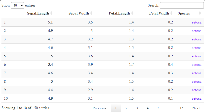
To recap: DT tables are feature-rich! But with all those features comes at least as many switches, dials, and toggles to adjust them all. Virtually all aspects of a DT table are adjustable, but figuring out exactly how to do it can be challenging. You can find out more about all the various options here.
What kinds of user actions can I react to with a DT table?
Answer: By default, Shiny tracks a handful of conditions for DT tables while the app runs, handing the values of these conditions over to the server using the input object. Three particularly useful ones include the current rows selected, the current search term in the search box, and the row, column, and value of the most recent cell clicked.
##Example--watching several properties of a DT table in real time

library(shiny)
library(DT)

ui = div(

  DTOutput("sampleDT"),
  #Three text displays
  textOutput('text1'),
  textOutput('text2'),
  textOutput('text3'),

)

server = shinyServer(function(input, output, session){

  output$sampleDT = renderDT({

    datatable(iris)

  })

  #Three observers to track properties of user interactions with the table and render them as text in the UI so we can see them. All the pasting is just to make them readable.
  observe({
    output$text1 = renderText(paste0("The current rows selected are: ",
                                     paste0(input$sampleDT_rows_selected,
                                            collapse = ', '))
                              )
  })

  observe({
    output$text2 = renderText(paste0("The current search term is: ", input$sampleDT_search))
  })

  observe({
    output$text3 = renderText(paste0("Here are the row, column, and value info for the most recently clicked cell: ",
                                     paste0(input$sampleDT_cell_clicked,
                                            collapse = ', '))
                              )
  })

})

shinyApp(ui, server)

Here, we’re watching to see what rows are selected, what is in the search box, and what the position and value of the most recently clicked cell is.
As demonstrated elsewhere in this post, since you can “watch” these properties as they change, you can therefore also respond to their changes if you want to.
Earlier, we saw the selection parameter; when it is set to ‘none’, row selection is turned off, meaning users wouldn’t be able to select rows and you would not be able to track row selections. If, instead, selection is set equal to “list(target = ‘column’)”, columns will be selected on click instead of rows, which you can track using *_columns_selected format. target can also be set to ‘row+column’, in which case both row and column selection is enabled via different user click behaviors. Lastly, target can also be set to ‘cell’, with cell selection trackable using *_cells_selected format.
A staggering range of additional DT table properties can be tracked if the option stateSave is set to TRUE inside of datatable(). These properties can then be accessed using *_ state format and include the current page length, column sorting information, pagination information (like what row is starting the current visible page), and more. Coverage of these properties are outside the scope of this manual.
How do I update a DT table in response to user actions?
Answer: That depends–I can imagine two different things one might mean when they ask this question.
First, building off the previous question in this section, a DT table can be made user-editable via the editable parameter in datatable(). editable can be set to ‘cell’, ‘row’, ‘column’, or ‘all’ to enable editing of individual cells, whole rows at a time, whole columns at a time, or the whole table at a time, respectively.
As a user, though, actually editing a DT table can be a little cumbersome:
- First, one must double-click the table somewhere relevant to get input boxes to appear.
- One must then do whatever editing they wish to do inside those boxes.
- Then, one must hit control+enter to save the changes (or hit escape to clear them).
The example code below shows off some of the basics of editable DT tables.
##Example--An editable DT table

library(shiny)
library(DT)

ui = div(

  DTOutput("sampleDT"),
  #Text outputs showing the results of the editing process
  textOutput("text1"),
  textOutput("text2"),
  textOutput("text3")

)

server = shinyServer(function(input, output, session){

  output$sampleDT = renderDT({

    datatable(iris,
              editable = 'column') #Here, I've enabled editing of whole columns at a time.

    })

  #Three observers, each watching the editing process and reporting to the UI various status changes.
  observe({
    output$text1 = renderText({
      paste0("The row(s) editted: ",
             paste0(input$sampleDT_cell_edit$row, collapse = ", "))
    })
  })

  observe({
    output$text2 = renderText({
      paste0("The column(s) editted: ",
             paste0(input$sampleDT_cell_edit$col, collapse = ", "))
    })
  })

  observe({
    output$text3 = renderText({
      paste0("The new values of those cells: ",
             paste0(input$sampleDT_cell_edit$value, collapse = ", "))
    })
  })

})

shinyApp(ui, server)

Here, we double-click to begin editing the Sepal.Width column. We then make our changes and press Control+Enter to save them. We then get confirmation, by watching the input object, that our edits have been registered (text below the table).
In this way, you can let your users update a table themselves, if that makes sense in your context! However, a few words of caution:
- The changes made to a table in this way are not as “permanent” as one may initially assume. The data being displayed at that time will be updated, but the original data source will not be–this is intentional and ensures your original data are not being overwritten by your users unless that is what you want. If it is, make sure to use the new, post-edit values to make your users’ edits permanent in whatever ways you want.
- Going along with the previous bullet, edits will generally persist for an R Shiny session so long as the renderDT({}) expression doesn’t rerun–if it does, it’ll (likely) pull from the original data source to remake the table. If you haven’t edited the original data by that point, the edits will be lost.
- Because a user has to double-click in the table to begin editing it, row/column selection will often trigger at the same time (see video above), which can be disorienting. Unless you really need both features, I’d recommend disabling selection whenever editing is enabled.
- The user actions needed to start and stop editing are NOT intuitive, nor are they well-explained by DT‘s UI–you will want to make sure your app clearly explains them.
If, instead, you want to update the table in some other way for some other reason–because a user toggled a selectInput(), for example–we can use a *Proxy() function, much as we did with leafletProxy(). The advantage of using dataTableProxy() is that it updates a table rather than redrawing it, which is more efficient and what a user generally expects. It also preserves (or allows you to preserve) certain features of the table’s current state, such as which columns are sorted and what page the user is on, which can enhance the user experience.
In the example below, I’ll use replaceTable() alongside dataTableProxy() to change out the data being displayed in the table as a user adjusts a numericInput():
##Example--A numeric input controls which rows of data are shown. dataTableProxy is used to update the table rather than redraw it, allowing for efficiency and for maintaining things like current sort and row selection.

library(shiny)
library(DT)
library(dplyr)

ui = div(

  DTOutput("sampleDT"),

  #Numeric selector that controls which rows are shown--the Sepal.Length value needs to be higher than that selected here.
  numericInput("sepal_lengths",
              "Pick which values to keep",
              min=min(iris$Sepal.Length),
              max=max(iris$Sepal.Length),
              value=min(iris$Sepal.Length),
              step = 0.5)

)

server = shinyServer(function(input, output, session){

  output$sampleDT = renderDT({

    datatable(iris)

    })

  #Watch the numericInput and filter the original data accordingly. Then, simply replace the data being shown in the table rather than redrawing it.
  observeEvent({input$sepal_lengths}, {

    filtered_data = iris %>%
      dplyr::filter(Sepal.Length > input$sepal_lengths)

    dataTableProxy('sampleDT') %>%
      replaceData(filtered_data,
                  resetPaging = FALSE, #We can decide whether to keep the current paging in the table or not.
                  clearSelection = 'none') #We can also decide if replacing the data should reset the selections or not.

  })

})

shinyApp(ui, server)

Here, a numericInput() allows for filtering the records in the table according to their Sepal.Length values. Because we use dataTableProxy(), the table is updated, not redrawn, allowing us to preserve its current properties (such as row selection) to the extent we want.
Other functions (addRow(), selectColumn(), selectPage(), etc.) allow you to do other things to DT tables using dataTableProxy(), such as add new records, select certain rows or columns, switch pages, and more. You can get a greater sense of all your options by examining this help documentation.
Interactive Plots Using the Plotly package
What if I already know ggplot2 and don’t want to learn another graphing package?
Answer: You’re in luck–you don’t necessarily need to learn another graphing package! There is a fairly meaty “cheat code” available here: the ggplotly() function. However, the whole thing is a little bit of a Faustian bargain, so whether you will actually want to use or rely on it may depend.
For some context, plotly is a graphing system not native to R (though neither is ggplot!) designed separately from ggplot and built entirely with interactivity in mind, unlike ggplot. In light of that, plotly graphs 1) don’t look like ggplots in either their code or appearance by default and 2) come with a ton of interactivity features right out of the box, similar to DT tables.
However, because graphs are ultimately comprised of fundamentally the same elements, plotly code will tend to have parallels with ggplot code that ggplot users might recognize and vice versa–the terminology and syntax will just be different and not map 1-to-1 in all respects. If you really wanted to, you could create (more or less) the exact same, sophisticated graph using both packages; the major differences would be that the plotly graph would be interactive and the ggplot would (probably) be a bit more “sophisticated” thanks to ggplot‘s easier customization system.
All of this is to say that, if you want an interactive but unfussy graph, plotly might be the way to go, even if you know ggplot and don’t know plotly. However, if you know ggplot very well and want to make a very sophisticated graph but want it to also be interactive, you might want to at least consider learning plotly and reaching some “compromise graph” that is attainable but still meets your standards.
…Or you could give ggplotly() a try. The rough idea of this function is for it to take a fully constructed ggplot as an input, break it down into its constituent pieces, remap all those pieces to the (roughly) equivalent plotly components, and rebuild the graph in plotly, brick by brick, so that plotly‘s interactivity pieces can be brought to bear. In theory, this function allows you to “have your cake and eat it too” by letting you use ggplot to make your graph and plotly to make it interactive, and it’s a logical (perhaps inevitable) consequence of the fact that the two systems may be different but are trying to get to the same place most of the time.
The usage guide here is brief: Build a ggplot, stuff it into ggplotly(), then use plotlyOutput() and renderPlotly({}) following the formula used many times elsewhere in this post.
##Example--Using ggplotly() to convert a ggplot into a plotly interactive graph the "cheap and easy" way.

library(shiny)
library(plotly)
library(ggplot2)

ui = div(

  #Notice plotlyOutput() and renderPlotly({}), as with other packages we've seen.
  plotlyOutput("samplePlotly"),

)

server = shinyServer(function(input, output, session){

  output$samplePlotly = renderPlotly({

    #We first make our ggplot
    plot1 = ggplot(iris, aes(x = Sepal.Length, y = Petal.Length, color = Species)) +
      geom_point(size=1.5, alpha = 0.7) +
      geom_smooth(se = F) +
      scale_x_continuous("Sepal length") +
      scale_y_continuous("Petal length") +
      scale_color_discrete("Species", type = c("Orange", "Red", "Brown")) +
      theme_bw()

    #Then, we feed it to ggplotly--renderPlotly({}) expects the very last thing produced inside of its expression will be a plotly-class object!
    ggplotly(plot1)

    })

})

shinyApp(ui, server)

As the example above demonstrates, ggplotly() is not capable of turning even a relatively simple ggplot graph into the exact same plotly graph. This is because they use different systems with different underlying assumptions and behaviors. At its best, ggplotly() might be said to create the “equivalent” plotly graph out of the ggplot graph it’s been given, but your mileage may vary–the result may still at least need additional customizing or tinkering to be exactly what you expect.
There are a number of other places that my research indicates ggplotly() might tend to fall short (though, with regular updates, anything is possible):
- Custom themes. One cool feature of ggplot2 is the theme() function, which allows you to customize every line, box, and text box in your graph. plotly has a similar function called layout() that does many of the same things, but not all, and not always in the same way. So, your painstakingly customized ggplot2 theme might not always make the move to plotly exactly how you’d like it to.
- Add-on packages and geoms. The “ggplot2universe” has grown a lot in recent years and now includes many dozens of packages, adding many new features and geoms. The more new or unusual the feature, the less likely it will convert to plotly faithfully.
- Fonts, text annotations, labels, etc. How the two packages think about text differs a little (in part because plotly thinks about text more like how a web language might), so graphs in which, e.g., text labels are a key piece (such as a network graph) might look different or need modifying after the conversion to look right.
- Performance and speed. Occasionally, elements will make the switch successfully, but the interactive components of those elements won’t work as well as they would have on a natively constructed plotly graph because plotly had to make educated guesses about what to do with elements that were once static by design. That only goes so well sometimes! Perhaps more importantly, the conversion process itself comes with processing overhead that will make ggplotly graphs slower to rebuild or modify than a native plotly graph would be.
To summarize: If ggplotly() works for you–maybe either because you’re too heavily invested in ggplot2 to learn another system or because you’re not that particular and the “equivalent” plotly graph will work fine for you most of the time–great! But you shouldn’t expect it to work miracles.
How would I create a basic plotly graph (assuming I already know ggplot2)?
Answer: Similar to a ggplot graph, a plotly graph is built piece by painstaking piece. If you know, you know! In that way (and many others), the two packages are two peas in a pod.
Because plotly is relatively new to me (and ggplotly() generally works fine for me!), a full primer on plotly‘s structure, features, and syntax is outside the (current) scope of this manual. However, in this subsection, I’ll try to give you a “demo” of how one exemplar plotly graph is built and how someone familiar with ggplot2 (like I am) would recognize and map the components of a ggplot() call to those of a plot_ly() call instead.
- Just as ggplot() is the “starting point” of a ggplot graph, plot_ly() is the “starting point” of a plotly graph.
- plot_ly()’s first parameter is “data,” so the first thing you will feed it is the dataset you will be pulling data from for your graph, just as you would usually do inside ggplot().
- In a ggplot graph, the next thing you might often do is set global aesthetics for your graph inside the ggplot() function using the aesthetics function, aes(). Said differently, this is where you map columns in your dataset to graphical components, such as setting a column of temperature data to the x-direction of the graph (e.g., x = temperature) or a species column to different colors.
- You do the same basic thing inside plot_ly() to map your aesthetics, except that you don’t need a helper function like aes() but you do need to use ~s in front of any column names (e.g. x = ~temperature).
- In a generic ggplot graph, the next thing you might often do is specify a geom, a way of representing the data you’re graphing as some kind of geometric shape(s). That is, what kind of graph are you trying to make: a scatterplot, bar graph, line graph, etc.? You would do this by adding a geom_*() function call to your ggplot() call.
- In plotly, a trace is the equivalent of a geom, though there are also “types.” You can specify a type right inside of plot_ly(), e.g., type = “bar”, and that will dictate the general type of graph your graph will then become, kind of like a shortcut that precludes you needing to give any additional information about the shape your data should take. A “mode,” also supplied to plot_ly(), would clarify certain things about a type, if needed. For example, for type = ‘scatter’, mode = ‘markers’ or mode = ‘lines’ would create a scatterplot or a line graph, respectively.
- However, much as you might add geom “layers” to a ggplot graph, you can also/instead add traces to a plotly graph, e.g., add_lines() will add line-graph elements to your graph.
- One difference is that while ggplot() and geom_line() would be tied together with a +, plot_ly and add_lines() would be tied together using a dplyr pipe %>%.
- A key similarity is that geoms/traces are generally dependent on and inherit much of their info from the ggplot()/plot_ly() calls they are hooked to. However, they can also instead both be more “standalone” in the sense that they can receive their own data, aesthetics, labeling, etc., and the system will find a way to bundle everything together into a cohesive whole anyway, assuming it can.
- When making a ggplot graph, the last major step is often customization using either scale_*() functions and/or theme() or one of its relatives. In plotly, much of this customization is instead handled by the layout() function.
- If you are familiar with ggplot‘s theme() function, you already know the “joy” of first choosing a property (axis.title.y), then using the associated element_*() function (element_text() in this case) to then change values, like this: theme(axis.title.y = element_text(size = 12)).
- layout() works very similarly, for better or worse: You name an attribute of your graph (e.g., yaxis) inside layout(), then either assign it a value (if that attribute has only one sub-attribute) or else you assign it a list and inside that list assign values to each sub-attribute you want to change. In other words, a lot of “sub-nesting” occurs in layout() calls, much the same as in theme() calls. There’s also a similar need to remember names of all the attributes, sub-attributes, values, etc. to appreciate where and how to adjust a specific property of your graph.
- Much as you can with ggplot graphs, you can pack plotly graphs into named variables so as to save intermediate steps or lender them on demand later. In Shiny Apps, this can be useful because you can build most of a graph, save that intermediate object, then modify it and render it later in response to a user input.
In the example below, I put all the above together to render a graph that bears at least a resemblance to the graph we produced in the previous subsection:
##Example--Server-side code that would recreate a ggplot from an earlier example using plotly instead (more or less).

output$samplePlotly = renderPlotly({

    #HERE IS THE GGPLOT WE MADE EARLIER, FOR REFERENCE.
    # plot1 = ggplot(iris, aes(x = Sepal.Length, y = Petal.Length, color = Species)) +
    #   geom_point(size=1.5, alpha = 0.7) +
    #   geom_smooth(se = F) +
    #   scale_x_continuous("Sepal length") +
    #   scale_y_continuous("Petal length") +
    #   scale_color_discrete("Species", type = c("Orange", "Red", "Brown")) +
    #   theme_bw()

    #We can use the add_lines() trace to make a smoothed line like geom_smooth() makes, but we have to pre-calculate the data for that line ourselves because add_lines() won't do it for us like geom_smooth() does. We'll do that here using the loess() [what geom_smooth() uses by default] and predict() functions. This code block is complements of ChatGPT--the loess() and do() functions are not part of my regular R vocab! But they sure work wonders here to create predicted Y values for each species we can then use to draw our lines.
    smoothed_fit = iris %>%
      group_by(Species) %>%
      do(
        data.frame(
          x = .$Sepal.Length,
          y = predict(loess(Petal.Length ~ Sepal.Length, data = .))
          )
        )

    #Then, the plot_ly call. Here, we map the aesthetics x, y, and color to specific columns in our dataset using ~s. We then also set the discrete colors we want to use throughout the graph with the colors parameter, something we otherwise have to do using scale_color_discrete() in ggplot.
    plot_ly(iris,
            x = ~Sepal.Length,
            y = ~Petal.Length,
            color = ~Species,
            colors = c("Orange", "Red", "Brown")) %>%
      #We then add a markers trace (points)--we can set size and alpha here much as we might inside geom_point()
      add_markers(size = 1.5,
                  alpha = 0.7) %>%
      #Next, we add our smoothed lines, specifying a new local dataset here as well as new local x and y aesthetics that apply to only this trace, much as we could do in ggplot. We also turn the legend off for this trace, as it would be redundant with the one for markers. Combining the two legends together (to have points with lines through them) is possible but tedious, so I omit it here.
      add_lines(data = smoothed_fit,
                x = ~x,
                y = ~y,
                showlegend = FALSE) %>%
      #Lastly, layout. Here, we first set the background of the plotting area and the 'paper area' around it white, as in theme_bw().
      layout(
        paper_bgcolor = 'white',
        plot_bgcolor = 'white',
        #We then adjust the x-axis, which has many sub-attributes. We give the axis a new title, we adjust the properties of the grid lines and the axis line, and we make the axis labels have black text.
        xaxis = list(title = "Sepal length",
                     gridcolor = 'grey',
                     linecolor = 'black',
                     linewidth = 2,
                     tickfont = list(color = 'black')),
        #We do the same with the y-axis.
        yaxis = list(title = "Petal length",
                     gridcolor = 'grey',
                     linecolor = 'black',
                     linewidth = 2,
                     tickfont = list(color = "black")),
        #Finally, we adjust the legend title and the legend position to be centered as it typically is in a ggplot.
        legend = list(title = list(
                        text = "Species"),
                      x = 1, #Move the legend all the way right.
                      xanchor = "left", #Specifically, put the LEFT side of the legend all the way right.
                      y = 0.5, #Center it vertically.
                      yanchor = "middle") #Specifically, put the CENTER of the legend in the center.
      )

    })

To me, at least, plotly feels neither “better” nor “worse” than ggplot–just different, with different mechanics called different things largely corresponding to one another to arrive at a similar place, albeit an interactive one!
However, it does seem as though certain things that might be more “automatic” in ggplot generally need to be done more “manually” in plotly and that there are fewer “shortcuts,” although I’m sure there are many counter-examples. Still, even if plotly were more “manual” than ggplot in many ways, that could be a good thing sometimes because it would force you to be more intentional about your choices than you otherwise would be.
So, if you were like me and afraid of learning plotly, don’t be! But also don’t feel ashamed if you don’t feel like it and would rather keep using ggplot and ggplotly() instead. Both routes can get you to a nice place.
How can users interact with plotly graphs by default, and how do I control these interactive elements?
Answer: Much as with DT‘s tables, plotly‘s graphs come with a pile of interactive elements out of the box. However, these aren’t all beneficial in all contexts, so it’s important to know 1) What interactivity elements come along with plotly graphs and 2) How to disable or modify certain ones if they don’t make sense in your context.
First, here’s a quick rundown of the interactive elements that plotly graphs tend to come with by default:
- Tooltips on mouse hover: If you hover over a line, point, or other similar shape, a tooltip will appear that reports data like the x and y values associated with that datum as well as any group affiliation. The contents of these tooltips can be customized (see below). A button in the toolbar will, when selected, cause tooltips to come up simultaneously for the nearest datum to the mouse in every group to facilitate comparisons.
- Legend group visibility toggling: If you have a legend for a grouping variable, you can click the keys of that legend to show/hide specific groups–the graph will automatically adjust the axes limits if needed, allowing you to focus on some subgroups and ignore others.
- Image snapshotting: A camera button allows for saving a snapshot of a graph’s current state to file.
- Viewport control/Pan and zoom: Users can select areas of the graphing window to zoom into, with double-clicking restoring the original zoom level and viewport. Users can also pan the viewport around to focus on different regions of the data, which is especially useful when zoomed in. Several other buttons in the toolbar will allow users to restore the graph to its original zoom, pan, and viewport.
- Box and lasso selection: Two buttons in the interface allow users to surround data in the graph with their mouse to “highlight” them, causing all other data in the graph to dim. Useful for highlighting certain subsets or regions of data.
- 3D rotation: If you have a 3D graph, users can rotate their viewport to look at the graph from different angles, which can make it much easier to interpret these kinds of graphs.
As you can hopefully glean from the list above, many of plotly‘s interactive elements are controlled by a toolbar known as the “modebar,” which is itself regulated by the config() function. If you want to eliminate the modebar, taking away most interactive elements in the process, you can pass FALSE to the displayModeBar parameter inside config():
##Example--modifying our existing plotly graph from above to disable the interactive modebar. Code has been condensed here for convenience.

smoothed_fit = iris %>%
      group_by(Species) %>%
      do(data.frame(x = .$Sepal.Length, y = predict(loess(Petal.Length ~ Sepal.Length, data = .))))

    plot_ly(iris, x = ~Sepal.Length, y = ~Petal.Length, color = ~Species, colors = c("Orange", "Red", "Brown")) %>%
      add_markers(size = 1.5, alpha = 0.7) %>%
      add_lines(data = smoothed_fit, x = ~x, y = ~y, showlegend = FALSE) %>%
      layout(paper_bgcolor = 'white', plot_bgcolor = 'white',
             xaxis = list(title = "Sepal length", gridcolor = 'grey', linecolor = 'black', linewidth = 2, tickfont = list(color = 'black')),
             yaxis = list(title = "Petal length", gridcolor = 'grey', linecolor = 'black', linewidth = 2, tickfont = list(color = "black")),
             legend = list(title = list(text = "Species"), x = 1, xanchor = "left", y = 0.5, yanchor = "middle")) %>%
      config(displayModeBar = FALSE) #Disable the modebar.
If you instead want to remove just one or a couple of buttons, you can pass their names individually to the modeBarButtonsToRemove parameter. You may have to do a little Googling to figure out the names for each button though, as the documentation doesn’t list them all. Here, I’ll remove a few of them to show you how it looks:
##Disabling just some of plotly's modebar buttons instead.

smoothed_fit = iris %>%
      group_by(Species) %>%
      do(data.frame(x = .$Sepal.Length, y = predict(loess(Petal.Length ~ Sepal.Length, data = .))))

    plot_ly(iris, x = ~Sepal.Length, y = ~Petal.Length, color = ~Species, colors = c("Orange", "Red", "Brown")) %>%
      add_markers(size = 1.5, alpha = 0.7) %>%
      add_lines(data = smoothed_fit, x = ~x, y = ~y, showlegend = FALSE) %>%
      layout(paper_bgcolor = 'white', plot_bgcolor = 'white',
             xaxis = list(title = "Sepal length", gridcolor = 'grey', linecolor = 'black', linewidth = 2, tickfont = list(color = 'black')),
             yaxis = list(title = "Petal length", gridcolor = 'grey', linecolor = 'black', linewidth = 2, tickfont = list(color = "black")),
             legend = list(title = list(text = "Species"), x = 1, xanchor = "left", y = 0.5,yanchor = "middle")) %>%
      config(modeBarButtonsToRemove = c('lasso2d', 'autoScale2d', 'hoverCompareCartesian')) #Disabling a random subset of the modebar buttons.

Interestingly, removing the zooming buttons doesn’t actually remove that functionality entirely, as users will still be able to zoom and unzoom the graph with their mouse by default. To disable zooming entirely (whether the buttons are also removed or not), you can set the fixedrange sub-attribute of each axis inside layout() to TRUE:
##Disabling  zoom functionality--substitute this layout call for the ones above.

layout(paper_bgcolor = 'white', plot_bgcolor = 'white',
             xaxis = list(
               fixedrange = TRUE, #Disabling panning and zooming by keeping the x-axis range of the viewport fixed.
               title = "Sepal length",
               gridcolor = 'grey',
               linecolor = 'black',
               linewidth = 2,
               tickfont = list(color = 'black')),
             yaxis = list(
               fixedrange = TRUE, #Same
               title = "Petal length",
               gridcolor = 'grey',
               linecolor = 'black',
               linewidth = 2,
               tickfont = list(color = "black")),
             legend = list(title = list(text = "Species"), x = 1, xanchor = "left", y = 0.5,yanchor = "middle"))
We can also turn to layout() to remove the ability to show/hide groups or individual traces by single- or double-clicking in the legend. Here, we can set the legend sub-attributes itemclick, itemdoubleclick, and groupclick all to FALSE:
##Disabling use of the legend to show/hide groups or traces using layout().

smoothed_fit = iris %>%
      group_by(Species) %>%
      do(data.frame(x = .$Sepal.Length, y = predict(loess(Petal.Length ~ Sepal.Length, data = .))))

    plot_ly(iris, x = ~Sepal.Length, y = ~Petal.Length, color = ~Species, colors = c("Orange", "Red", "Brown")) %>%
      add_markers(size = 1.5, alpha = 0.7) %>%
      add_lines(data = smoothed_fit, x = ~x, y = ~y, showlegend = FALSE) %>%
      layout(paper_bgcolor = 'white', plot_bgcolor = 'white',
             xaxis = list(fixedrange = TRUE, title = "Sepal length", gridcolor = 'grey', linecolor = 'black', linewidth = 2, tickfont = list(color = 'black')),
             yaxis = list(fixedrange = TRUE, title = "Petal length", gridcolor = 'grey', linecolor = 'black', linewidth = 2, tickfont = list(color = "black")),
             legend = list(
               #Turning off the ability to use the legend to show/hide groups/traces.
               itemclick = FALSE,
               itemdoubleclick = FALSE,
               groupclick = FALSE,
               title = list(text = "Species"),
               x = 1,
               xanchor = "left",
               y = 0.5,
               yanchor = "middle"))
A quirk of the above approach is that your cursor will still change to a pointer when hovering over the legend as though you could still interact with it even though clicks there will no longer have any effect. Keep in mind that that may send mixed signals to your audience. [You *can* use CSS to adjust this using the cursor property, but I won’t demonstrate that here].
For the tooltips on mouse hover, we can turn to yet another function: style(). If we want to eliminate the tooltips entirely, we can set hoverinfo inside style() to ‘none’:
##Example--turning off the hover tooltips

smoothed_fit = iris %>%
      group_by(Species) %>%
      do(data.frame(x = .$Sepal.Length, y = predict(loess(Petal.Length ~ Sepal.Length, data = .))))

    plot_ly(iris, x = ~Sepal.Length, y = ~Petal.Length, color = ~Species, colors = c("Orange", "Red", "Brown")) %>%
      add_markers(size = 1.5, alpha = 0.7) %>%
      add_lines(data = smoothed_fit, x = ~x, y = ~y, showlegend = FALSE) %>%
      layout(paper_bgcolor = 'white', plot_bgcolor = 'white',
             xaxis = list(fixedrange = TRUE, title = "Sepal length", gridcolor = 'grey', linecolor = 'black', linewidth = 2, tickfont = list(color = 'black')),
             yaxis = list(fixedrange = TRUE, title = "Petal length", gridcolor = 'grey', linecolor = 'black', linewidth = 2, tickfont = list(color = "black")),
             legend = list(title = list(text = "Species"), x = 1, xanchor = "left", y = 0.5, yanchor = "middle"))  %>%
      style(hoverinfo = 'none') #Turn off the tooltips on mouse hover.
But we don’t have to choose between just ‘all’ or ‘none’; we have intermediate options! By default, plotly‘s tooltips display a datum’s x value, y value, associated text, and name. This is represented by hoverinfo‘s default value of ‘x+y+text+name’, and it’s why our sample graph’s tooltips display two values separated by a comma (an x and a y) plus the datum’s group name. Since we didn’t provide any custom text to our traces when we made them, none is shown in the tooltips.
So long as you separate them with +s, you can request any sub-mix of these four things using hoverinfo. For example, the following would request only the x value and the group name:
#[REST OF PLOTLY CODE HERE]
style(hoverinfo = 'x+name') #Being more precise about the tooltip info we want.
If you want to customize your tooltips so they say only exactly what you want them to (and who doesn’t?), the best way to do this is probably by:
- Creating custom text strings for each record in your data that say what you want them to,
- Feeding these to the text aesthetic inside either plotly or one of your traces, and
- Setting hoverinfo to ‘text’ so only that text is shown.
##Creating custom tooltip content for every data point in our graph.

smoothed_fit = iris %>%
      group_by(Species) %>%
      do(data.frame(x = .$Sepal.Length,
                    y = predict(loess(Petal.Length ~ Sepal.Length, data = .))))

#Here, we'll make a new column that will contain text we want the tooltip to say for every point we might graph.
    iris$sampleText = NA #Make this column empty to start.

    #Use a for loop to build a custom text string for each row. Gloss over this if it looks too unfamiliar!
    for(i in 1:nrow(iris)) {
      iris$sampleText[i] = paste0("This is species ",
                                  iris$Species[i], " and x is ",
                                  round(iris$Sepal.Length[i], 1))
    }

    plot_ly(iris, x = ~Sepal.Length, y = ~Petal.Length, color = ~Species, colors = c("Orange", "Red", "Brown")) %>%
      add_markers(size = 1.5, alpha = 0.7,
                  text = ~sampleText) %>% #Map our text strings to the text aesthetic for just our points (we didn't add this column to the smoothed_fit data frame also, so we need to keep this aesthetic local to this trace).
      add_lines(data = smoothed_fit, x = ~x, y = ~y, showlegend = FALSE) %>%
      layout(paper_bgcolor = 'white', plot_bgcolor = 'white',
             xaxis = list(fixedrange = TRUE, title = "Sepal length", gridcolor = 'grey', linecolor = 'black', linewidth = 2, tickfont = list(color = 'black')),
             yaxis = list(fixedrange = TRUE, title = "Petal length", gridcolor = 'grey', linecolor = 'black', linewidth = 2, tickfont = list(color = "black")),
             legend = list(title = list(text = "Species"), x = 1, xanchor = "left", y = 0.5, yanchor = "middle"))  %>%
      style(hoverinfo = 'text') #Only display our custom text on hover.

Just keep in mind that if you have multiple traces, multiple tooltips could appear unless you suppress some of them by setting their hoverinfo to ‘none’ or ‘skip’ (to clarify, hoverinfo is also a parameter inside the add_*() functions, so you can also adjust hover properties on a trace-by-trace basis if you’d prefer, whereas style() does it globally).
In closing: plotly graphs come packed with interactive features, so many so that you may finding yourself wanting to disable or curtail some of them. It’s always possible to do so, but the toggles with which to do it are scattered amongst the style(), layout(), config(), and trace-specific functions, so it may take some practice to remember them all.
How do I update a plotly graph that already exists?
Answer: Just as with DT and leaflet, plotly offers a plotlyProxy() function for updating a graph rather than redrawing it, which is more efficient and more what a user will expect.
As with leafletProxy(), plotlyProxy() needs to be given an id of the object to update and the session object as inputs. As with dataTableProxy(), we need to pair plotlyProxy() with a helper function, plotlyProxyInvoke(), to actually get anything done. Beyond that, plotly‘s Proxy system is a bit more convoluted than any we’ve seen before.
One trick to using plotlyProxyInvoke() is to know what options you have for its methods parameter, which controls what you are allowed to update about your graph and how. Here are some common methods and what they do:
- “restyle”: Lets you adjust traces, including remapping variables and changing cosmetics of traces like their colors. Probably the one you will need most often.
- “relayout”: Lets you adjust layout() features, such as where your legend is located. Likely the one you will need most after “restyle”.
- “addTraces” and “deleteTraces”: Self-explanatory!
- “moveTraces”: Lets you shuffle the order in which traces are drawn, affecting things like which traces appear on top of others and what order legends are drawn in.
- “extendTraces”: Add new data to existing traces.
I won’t demonstrate all these features here, if for no other reason than that I still find them confusing myself and so may not be able to do them justice!
Still, I’ll demonstrate one example below of a reasonable use case for these tools. In this example, users will be able to enter the data for a new data point and then click a button to add it to the graph. Because this requires enough moving parts as it is, I’ll simplify the graph somewhat by removing the smoothed lines and folding the marker trace components into the plot_ly() call.
##Example--using a plotlyProxy() and plotlyProxyInvoke() to add a user-inputted data point to our scatterplot.

library(shiny)
library(plotly)
library(dplyr) #We need the bind_rows function here.

#We'll create a copy of the iris dataset so that we can safely modify it.
fakeiris = iris

#We'll create a colors column to hold the color strings we'll want plotly to use.
fakeiris$colors = "Orange"
fakeiris$colors[fakeiris$Species == "versicolor"] = "Red"
fakeiris$colors[fakeiris$Species == "virginica"] = "Brown"

ui = div(

  plotlyOutput("samplePlotly"),

  #We'll add in 3 new inputs. These will allow the user to enter new sepal and petal length values for a new data point, as well as to select which species we'll add that data point to.
  selectInput("whichspecies",
              "Which species should we add the point to?",
              choices = c("Setosa" = "setosa",
                          "Versicolor" = "versicolor",
                          "Virginica" = "virginica"),
              selected = "Setosa"),
  numericInput("newXVal",
               "Enter a new x value",
               min = round(min(fakeiris$Sepal.Length),1),
               max = round(max(fakeiris$Sepal.Length),1),
               value = round(mean(fakeiris$Sepal.Length),1),
               step = 0.1),
  numericInput("newYVal",
               "Enter a new y value",
               min = round(min(fakeiris$Petal.Length),1),
               max = round(max(fakeiris$Petal.Length),1),
               value = round(mean(fakeiris$Petal.Length),1),
               step = 0.1),

  #An action button will trigger the new point to be added.
  actionButton("addpoint",
               "Add new point now!")

)

server = shinyServer(function(input, output, session){

  #We're simplifying our plotly graph a little here by moving everything from add_markers() into plot_ly() as well as by removing the smoothed lines.
  output$samplePlotly = renderPlotly({

    plot_ly(fakeiris, x = ~Sepal.Length, y = ~Petal.Length, color = ~Species, colors = ~colors,
            type = "scatter", mode = "markers",
            marker = list(opacity = 0.7, size = 11)) %>% #This line includes a different size value than before, which has to do with how plotly.js calculates marker sizes.
      layout(paper_bgcolor = 'white', plot_bgcolor = 'white',
             xaxis = list(fixedrange = TRUE, title = "Sepal length", gridcolor = 'grey', linecolor = 'black', linewidth = 2, tickfont = list(color = 'black')),
             yaxis = list(fixedrange = TRUE, title = "Petal length", gridcolor = 'grey', linecolor = 'black', linewidth = 2, tickfont = list(color = "black")),
             legend = list(title = list(text = "Species"), x = 1, xanchor = "left", y = 0.5, yanchor = "middle"))

    })


#Observer to watch the add button.
  observeEvent(input$addpoint, {

    #We'll first compile the info about the new data point we're going to add and put that info into a data.frame with similar column names to those in the iris dataset.
    df_toadd = data.frame(Sepal.Length = input$newXVal,
                          Petal.Length = input$newYVal,
                          Species = input$whichspecies,
                          colors = "Orange") #The "default" color will be orange.
    trace = 0 #The "default" trace will be 0--this will be explained below.

    #Now, we override those defaults as needed, depending on what the user has selected.
    if(input$whichspecies == "versicolor") {
df_toadd$colors = "Red"
trace = 1
}
    if(input$whichspecies == "virginica") {
df_toadd$colors = "Brown"
trace = 2
}

    #Here, we use a little cheat--we bind the new data point onto the bottom of our iris dataset using bind_row(). We then save that change to our global environment using the <<- operator. It would be better to use reactiveValues() to track changes to our dataset over time, but I've chosen this route here to keep things simpler.
    fakeiris <<- bind_rows(fakeiris, df_toadd)

    #Next, to only update the species we're adding a point to, we will filter our data down to just that species for inserting into the proxy.
    iris2 = fakeiris %>%
      filter(Species == input$whichspecies)

    #We can finally begin our proxy! plotlyProxy() takes two inputs--the id of the plot we're updating and the session object.
    plotlyProxy("samplePlotly", session) %>%
      #We'll then use plotlyProxyInvoke and its "restyle" method to redraw just the data for the one species we're adding a data point to.
      plotlyProxyInvoke("restyle",
                        #plotlyProxyInvokes() need a lot of nested lists! The first list here indicates attributes about the graph we're going to restyle. Here, those are x, y, color, colors, marker.size, and marker.opacity. Many of these gets a list too because we could supply new x/y/etc data for each trace if we wanted to, so each attribute could have multiple sets of inputs. Lastly, it expects the new data themselves to be in lists, if their length is >1. So, you might have up to three layers of lists here, depending on your needs. We only need two, though, since we're modifying only one trace.
                      list(x = list(iris2$Sepal.Length),
                           y = list(iris2$Petal.Length),
                           color = list(iris2$Species),
                           colors = list(iris2$colors),
                           marker.size = 11,
                           marker.opacity = 0.7
),
                      list(trace)) %>% #Each trace in a plotly graph gets a unique index number, which starts counting at 0 and not 1, so the first trace here (the one for species setosa) is trace = 0. If there is more than one trace being modified, all index values are provided here, once again inside a list().
      #We then also need plotlyProxyInvoke() a second time, this time using the relayout method--otherwise, because we are altering the traces in the graph, the legend would redraw too but using its default settings. Everything here basically repeats the layout() code from earlier to prevent the legend from changing visibly.
      plotlyProxyInvoke("relayout",
                        list(legend = list(title = list(text = "Species"),
                                           x = 1, xanchor = "left", y = 0.5, yanchor = "middle")),
                        list(trace))
  })
})

shinyApp(ui, server)

Users can enter data for a new data point, then indicate which species that data point is for before clicking a button to add the point to the graph. This is done using plotlyProxy() so that only the elements that need to be changed are changed, preventing the graph from being entirely redrawn.
I’d encourage you to carefully read my annotations in the code above before continuing; this example is more involved than most others in this manual! Still, let’s cover some of the key points again here.
First, you can use the “restyle” method inside plotlyProxyInvoke() to alter one or more attributes of a graph–these include x, y, color, and more. Thus, the second input to plotProxyInvoke() will need to be a list() to contain these.
Then, for each attribute you are changing, you could change that attribute in one or more traces. Here, we have three traces–a set of markers for each species. If we wanted to add data points to all three traces simultaneously, we’d need to pack into the x attribute a list() containing the sets of x data to be added to each trace. Since, in this case, we are modifying only a single trace, we omit this layer of list()s in the example above.
Then, the data for a single trace themselves need to be in a list() also, assuming their length is greater than 1. Those lists()s are the ones we see given to x, y, color, etc. in the above example. Yikes!
Why all these lists? It’s because, under the hood, the plotly package is heavily relying on JavaScript tools and conventions–the “distance” between R and JavaScript here is very thin, if you want to think about it that way. This is one place where that is very obvious; JavaScript generally utilizes lists to store data, so we do too in our R code.
We see another example of this phenomenon in this example with our trace numbering. When traces get made, they get a unique index number that we can use to refer to them. These begin numbering at 0, not 1, which is how JavaScript (and many other languages) do their counting. This is why, to update our first trace for species “setosa,” we need to say trace = 0, not 1.
Lastly, notice that I had to use plotlyProxyInvoke() a second time, this time using the “relayout” method, not to change anything about the legend but rather to prevent it from being changed. If you alter any of your traces when restyling a graph, the legend will be redrawn too, but using its default settings. To prevent this, we just resupplied the original legend attributes to ensure that, when the legend is redrawn, it’s redrawn the same way as before. This isn’t necessarily efficient, but it’s still better than redrawing the whole graph!
One final note: I’m sure that the above could be done even more cleanly using “extendTraces” instead, but I was unable to figure out how to do it while tinkering for this example. See if you can figure out how to make it work, and let me know if you do!
What kinds of user actions can I watch and respond to for myplotly graphs?
Answer: While plotly‘s many interactive features mean that a user can interact with a plotly graph in many ways, there are only a handful you might regularly want to track and respond to “manually.” These include:
- “plotly_click” and “plotly_doubleclick“: When a user clicks or double-clicks a compatible entity inside your graph, these will track which trace number and record number those entities belong to as well as their x/y/z data values.
- “plotly_hover“: Same as above, except it triggers any time a user hovers over a compatible entity with their mouse.
- “plotly_selected“: Same as above, except it triggers whenever one or more compatible entities is/are selected using the box or lasso selector tools.
- “plotly_restyle” and “plotly_relayout“: Triggered whenever the graph is forced to restyle or re-layout, these will report the values of any new aesthetics or features as a list of lists. This is useful, for example, when you want to respond in some way when a user zooms in, which will trigger a restyle.
These should feel similar to user actions we can watch in other contexts. However, the way data about these actions are passed from the UI to the server for plotly graphs is different than any system we’ve seen so far–it doesn’t use the input object, and it requires a few extra steps to get up and running.
First, when making our plotly graph, we will need to register the event(s) we want to track and pass over to the server in this way using the event_register() function, which takes as input one of the event types noted above.
Second, we have to designate a source of a given event, which is like another id for the plot for which the event(s) will be tracked. We provide a source in the plot_ly() function. Sources make sense when you consider that the same graph can technically exist in multiple places in an app, and you may only want to track events in one of the versions.
Third, to observe or extract the data being passed from the UI to the server, we need to use a function called event_data(). event_data() takes two inputs: the event type (like those in the list above) and the source of the graph in question.
Let’s see all these new pieces in action. In the following example, when a user clicks on a point in our scatterplot, that point will be removed from the dataset and a restyle and re-layout will be triggered, just as they were when a point was added in the example in the previous sub-section of this post:
##Example--We add click event tracking to our plotly graph from the previous example. When users click a marker in the graph, we use data about which marker was clicked on to remove that entry from the dataset, then update the graph accordingly.

[The pre-UI and UI code from the previous example is omitted here to save space, since it is unchanged.]

server = shinyServer(function(input, output, session){

  output$samplePlotly = renderPlotly({

   plot_ly(fakeiris, x = ~Sepal.Length, y = ~Petal.Length, color = ~Species, colors = ~colors,
            type = "scatter", mode = "markers", marker = list(opacity = 0.7, size = 11),
            source = "ourgraph") %>% #First new thing: We give this graph another nickname for the source parameter here.
      layout(paper_bgcolor = 'white', plot_bgcolor = 'white',
             xaxis = list(fixedrange = TRUE, title = "Sepal length", gridcolor = 'grey', linecolor = 'black', linewidth = 2, tickfont = list(color = 'black')),
             yaxis = list(fixedrange = TRUE, title = "Petal length", gridcolor = 'grey', linecolor = 'black', linewidth = 2, tickfont = list(color = "black")),
             legend = list(title = list(text = "Species"), x = 1, xanchor = "left", y = 0.5, yanchor = "middle")) %>%
   event_register("plotly_click") #Second new thing: We register the plotly_click event for this plot.

    })

  #Third new thing--we have an observer watching the outputs of the event_data() function. We supply the event to watch and the graph to watch it for.
  observeEvent(event_data(event = "plotly_click", source = "ourgraph"), {

    #Extract the event data to use them more easily.
    event.dat = event_data(event = "plotly_click", source = "ourgraph")

    #Specifically, we will need the x and y data of the point clicked as well as its trace number.
    event.x = event.dat$x
    event.y = event.dat$y
    trace.num = event.dat$curveNumber

    #We make the "default" species setosa, then override it as necessary if a different species' point was clicked instead.
    trace.species = "setosa"
    if(trace.num == 1) { trace.species = "versicolor" }
    if(trace.num == 2) { trace.species = "virginica" }

    #We figure out which row in our data set has the same species, x, and y data as the point that was clicked.
    delete.row = which(fakeiris$Sepal.Length == event.x &
                    fakeiris$Petal.Length == event.y &
                    fakeiris$Species == trace.species)

    #We then delete that row.
    fakeiris <<- fakeiris[-delete.row,]

    #Then, we restyle the graph just as before, which this time will result in the clicked point disappearing from the graph.
    iris2 = fakeiris %>%
      filter(Species == trace.species)

    plotlyProxy("samplePlotly",
                session) %>%
      plotlyProxyInvoke("restyle",
                        list(x = list(iris2$Sepal.Length),
                             y = list(iris2$Petal.Length),
                             color = list(iris2$Species),
                             colors = list(iris2$colors),
                             marker.size = 11,
                             marker.opacity = 0.7),
                        trace.num) %>%
      plotlyProxyInvoke("relayout",
                        list(legend = list(title = list(text = "Species"),
                                           x = 1, xanchor = "left", y = 0.5, yanchor = "middle")),
                        list(trace.num))


  })

 [The second observer watching the add points button is also omitted here to save space, as it too is unchanged from the previous example]

})

shinyApp(ui, server)

We register click events with our graph such that the UI will report to the server information about any points clicked by the user. Those data are then used to find and remove the clicked point from the dataset and graph.
While it involves a few more steps than event-tracking of other interactable entities we’ve seen in this post, hopefully this example demonstrates that tracking user events in a plotly graph is not too hard and can be used to engineer dynamic responses to user actions.
Other cool things worth knowing
How do I collect files from users?
Answer: By using R Shiny’s fileInput().
Earlier in this post, I explained the various inputs a Shiny app may employ, but I purposely didn’t talk about fileInput()s because they are…weird.
First off: If you are hosting your R Shiny app somewhere other than on a Shiny Server you’ve personally set up, such as on ShinyApps.io, it’s important to know that your Shiny app will not have “write privileges.” This means it is not allowed to write or save files to the computer that is running it (for security reasons). This makes sense–otherwise, fileInputs() (and Shiny Apps in general) would be a fantastic way to dump malware onto other peoples’ systems!
The consequence is that, when a user uses a fileInput() to send a file to your app, your app needs to save it somewhere so it can work with it even though it’s not technically allowed to actually do that. So, it has to put the file somewhere temporary, cordoned off from the rest of the system. It can then promptly delete that file when the app is done running.
This all means:
- If we want to check out a file that’s been sent to us and use its contents in our app (such as loading data from it), we need to get the path to where the file has been temporarily stored on the computer running the app first.
- If we want to save the file submitted through our app in any permanent way, we’ll need to ship the file elsewhere–it can’t stay on the app or it’ll be deleted!
The first problem can be solved by inspecting the input object passed from the UI to the server whenever a fileInput() is used. Check this out:
#A very basic app with just a fileInput() and an observer watching that input so it will print the input object whenever a file is supplied to the input.
library(shiny)

ui = div(

  fileInput(inputId = "file1",
            label = "Send me a file!")

)

server = shinyServer(function(input, output, session){

  observeEvent(input$file1, {
    print(input$file1) #Send to the R console the contents of the input object from our fileInput.
  })

})

shinyApp(ui, server)

We see that the input objects holds four pieces of data on any files uploaded through a fileInput():
- The original name of the file on the sendee’s computer or device.
- The size of the original file (in bytes). This is useful because we can limit the size of files that can be uploaded.
- The type of file submitted. This is useful because we can install filters that restrict submissions to certain file types.
- Most importantly, an absolute path to where the file is being temporarily stored on the server running the app.
This means we can access the temporary path to the data file at any time using input$[file_object]$datapath format. So, if we want to then load that file into our App (e.g., the files being uploaded are picture files we could display), we could do something like this:
##Example app that allows submissions of photos and then displays them on the app.
library(shiny)

ui = div(

  fileInput(inputId = "file1",
            label = "Send me a file!"), #Don't forget this comma!

  imageOutput("submittedpic") #Output our submitted image.

)

server = shinyServer(function(input, output, session){

  #Render an image submitted via the fileInput()
  output$submittedpic <- renderImage({
    req(input$file1) #Only run this code when input$file1 exists (aka a file has been submitted). This input is "required" and cannot be NULL.

    list(src = input$file1$datapath, #renderImage is fussy--it needs to create a list containing some elements about the image it will be rendering. Notice the use of input$file1$datapath here.
         width = 250,
         height = 400)
    },
    deleteFile = F) #This argument is needed but we don't need to know what it does right now.

})

shinyApp(ui, server)

But what if we want to save the files submitted through the app? We’ll need to send them somewhere else. For that purpose, I generally use Google Drive, but you could use any similar cloud-based storage platform. I’ll only explain Google Drive in this post, though.
For this to work, we’ll need to be able to:
- Find the file in the app’s temporary storage.
- Move the file to somewhere that is still temporary (so we can write to it) but that “we” (as in the app) controls–a staging ground, so to speak.
- Authenticate with (aka “sign in to” but in a different way) Google Drive so that it knows the app is allowed to send files (otherwise, this would be a huge security hole for your Google Drive account !)
- Tell Google Drive where it should put the file once it gets it and what it should call it.
- Finally, actually ship the file.
We already know how to handle #1 above (that is, we already know how to get the absolute path to the file in our App’s temp storage), so let’s tackle #2 above next. Here is a custom function that will copy a file to a new, temporary directory for us when given the filepath to where the file currently is:
##Custom function that will make a copy of a file and place the copy in a new, temporary directory of our creation. We'll use that new temporary directory as a "staging ground" for sending files to Google Drive. If this looks too complicated, you can gloss over the details and just use the function later


prepare_GDrive_upload = function(filepath) {
#First, get the file extension of the file submitted. This uses a function in the tools package, so you may need to grab that package and turn it on first.
ext <- tools::file_ext(filepath)

#Second, create a temporary staging ground directory using the tempdir() function.
tmp.path <- file.path(paste0(tempdir(), "\\"))

#Third, we need to name our copy of the file. This code will give the file a random name of 20 letters and numbers so there's no chance we'll get two files with the exact same name. You could replace this with whatever you'd like.
name.me <- paste0(paste0(sample(c(LETTERS, 0:9), 20), collapse=""), ".", ext, sep = "")

#Finally, we copy the file from where it is currently to where we want it, using the file path, name, and extension we've saved above. We use the file.copy() function for that.
file.copy(from = filepath,
          to = paste0(str_remove(tmp.path,
                                 paste0(".", ext, sep="")),
                      name.me))

#The function will output both the new file's name and its new temporary directory.
return(list(name.me = name.me, tmp.path = tmp.path))

}
With this function, we can check item #2 off the list above. We’ll just need to provide it input$[fileInputname]$datapath as an input and it’ll handle the rest.
Now, we need to authenticate so that Google Drive will allow our Shiny App to send it files. We can do this using the gargle and googledrive packages. The process here was unintuitive for me, so pay close attention!
First, add this code to your global.R file (or the equivalent):
##Add to global.R
#Be sure to have the gargle package installed and turned on first!
options(
        gargle_oauth_email =  TRUE,
        gargle_oauth_cache = "[your app's name]/.secrets"
        )
This code first says “Yes, set up a secret token that can be stored within the app’s files that, when Google Drive sees it, will allow the app to send files as though the App were me.” Think of this as like an ID badge that can be flashed by the app when it goes to send a file that is similar to you being there in person to vouch for the app.
The code then says to store this token in a hidden folder called “.secrets” with the app’s folder system. This folder is hidden, but that doesn’t make it inaccessible, so be sure not to share it with anyone you don’t trust! In particular, don’t upload this folder to Github and/or tell Github to “ignore” it during submissions.
Then, run the following command locally in your R Console (not as part your regular App code): googledrive::drive_auth(). Be sure to have the googledrive package installed and turned on first!
This command will take you to a login page for Google Drive, where you will need to sign in and give permission for a token to be created and stored for this purpose. You will not need to run this command every time you use your app, but the tokens do periodically expire, so you may have to run it again every now and then to get a new token.
With our token in hand, we now just need to handle items #4 and #5 from the list above. First, we need to tell Google Drive where to put our file. We do that using the unique ID for the Google Drive folder we’re trying to send the file to. See here for more details. We can get that unique ID by running the following command: folder_id = googledrive::drive_get([URL for the folder])$id. Be sure to have the googledrive package installed and turned on first!
Once we have the ID, we can use the drive_upload() function in the googledrive package to send our submitted file to Google Drive:
##Example: Staging a submitted file, then uploading it to Google Drive:

prepared1 = prepare_GDrive_upload(input$file1$datapath) #Using our custom function from earlier.

      #Upload the file to our designated Google Drive location. We need to tell it where the file is staged on our computer (media argument), the ID of the Google Drive folder we're sending it to (path argument), and the name we want to give it there (name argument).
      drive_upload(media = paste0(prepared1$tmp.path, prepared1$name.me),
                   path = rawdata_id,
                   name = prepared1$name.me)
It wouldn’t be easy for me to demonstrate all of this machinery in a simple app, and I can’t hand out my Google Drive password, so hopefully you at least now have all the pieces you need to get this running successfully in your own app!
How do I prevent a user from providing an invalid input? (aka validation)
Answer: When there are “wrong” inputs a user can provide, or when you want to prevent a user from advancing until they have provided inputs that suit your needs, we need to validate the inputs (mark them as valid).
We can validate inputs in a few ways. The easiest way, if we can do it, is to prevent users from having invalid options they could give in the first place. selectInput() can be given a set of choices that users must choose from, so we could make sure all those choices are valid up front. numericInput() can be provided with min and max values that users can select from. Even fileInput() can be provided with an input for its “accept” argument to restrict what file types can be uploaded.
However, none of these approaches are foolproof. One common example involves selectInput(). If you provide a list of choices to a user using a selectInput(), one of them (the top one, by default) will be selected when your app launches. How will you know that a user meant to select that option and didn’t just skip or miss the question?
In instances like this, it’s useful to have (at least) one invalid choice included on purpose that you can make the initial choice so that you know for sure when a user has interacted with a specific feature (because we’ll switch from an invalid choice to a valid one). This invalid choice can even be used to guide the user towards the proper action they should take. Check this out:
##Example--A selectInput() has, as its first and default choice, an invalid selection that instructs users to make a different selection. Then, conditional logic (ifs and elses) handle what occurs next.

library(shiny)

ui = div(

  #A selectInput() with an "invalid" default/first option
  selectInput("pickme",
              label = "Select an option",
              choices = c("Please pick something", "A", "B", "C")),

  #Report to the user what's going on.
  textOutput("textmessage")
)

server = shinyServer(function(input, output, session){

  #Observer watches for the status of the selector and responds accordingly when a valid choice has been selected.
  observeEvent(input$pickme, {

    if(input$pickme == "Please pick something") {
      output$textmessage = renderText({
        "You haven't picked anything yet!"
      })
      } else {
        output$textmessage = renderText({
          "You've picked something! Nice work!"
        })
      } #Lots of layers of stuff to close here!
    })
  })

shinyApp(ui, server)

Here, we provide an invalid input as the first choice, and we use an observer plus conditional logic to respond to invalid versus valid choices.
Another common problem arises when users are allowed to use keyboards to interact with certain types of inputs. For some inputs, such as dateInput(), numericInput(), and selectizeInput(multiple = TRUE), users can use the backspace and delete keys on their keyboard to clear all selections (accidentally or purposely), leaving an input completely blank. On the server side, this results in a value of NULL.
This is a problem for at least two reasons. First, the if() function cannot take NULL as an input, so any if() checks that interface with that input will return errors if users clear out that input. Second, observeEvent({},{}) is programmed to ignore NULLs (and, by extension, a change to or from NULL) in its first expression. So, if users empty out an input, an observer may not even notice that change, let alone handle it correctly.
There are several things we can do about this, though. The first is that we can change observeEvent({},{}) to not ignore NULLs by setting its argument ignoreNULL to FALSE. However, this may cause problems inside the observer’s second expression–NULL is a bad input to a lot of functions in R, so it will often cause errors if our code in our second expression isn’t expecting it.
So, the second thing we can do is use req() (“require”). req() works a bit like if() but its behavior is more “extreme”–req() checks to see if something is TRUE or FALSE, and if it’s FALSE, it prevents any further operations in the entire expression it is in. req(NULL) is considered FALSE, so, if we place req([ourinput]) at the beginning of the second expression inside our observer, then that observer will not execute any code if the user’s input ever becomes NULL.
Sidenote: If if() makes more sense in your specific context than req() does, but NULL or other forms of missing data (NA, “”, etc.) could occur such that if() would return an error, you can use if(isTruthy(…)) to safely see if a value is missing or not before proceeding.
That may prevent errors, but it still may not be what we actually want. All of the above is helpful for ensuring our code doesn’t break, but a user still may be able to leave an input blank, and the app may still be unable to respond appropriately. If this is a problem in your context, we can turn to more drastic measures: strategically disabling a user’s keyboard powers.
The JavaScript code tucked inside the following example (fed into our app via the tags$script() function in the UI) checks whenever a user presses down on a key inside of the input with the id of pickme. Whenever that happens, the app then checks to see if the key was keyCode 8 (backspace) or keyCode 46 (delete). If it was either of these keys, we prevent the app from responding in its default way (that is, normally) and instead have it return nothing (false). In practice, this disables the user’s ability to use delete/backspace inside this input! Try it out:
##Example--Using JavaScript to prevent users from using their keyboard to empty out selectors.
library(shiny)

ui = div(

  #We use the tags$script() function to insert a custom JavaScript function that strategically forbids users from using their delete or backspace keys.
  tags$script(
    '
    $(document).on("keydown", "#pickme", function (e) {
      if (e.keyCode === 8 || e.keyCode === 46) {
        e.preventDefault();
        return false;
      }
    });
    '
  ),

  #Notice that we will not be able to use the backspace or delete keys when interacting with this input!
  numericInput("pickme",
              label = "Select a number",
              min = 0, max = 10,
              value = 5)
)

server = shinyServer(function(input, output, session){

  })

shinyApp(ui, server)
In this particular instance, it may also be good to prevent users from using the “e”, “E”, or “-” keys so as to prevent them from using scientific notation or negative numbers too!
What if you want to check to see if a whole bunch of inputs are valid or not? For example, what if your app is a form and you want to be able to check whether it has been filled out correctly? For more “sophisticated” and “thorough” validation like this, we can use the shinyvalidate package.
Basic usage of this package involves three steps:
- Turning on a validator (in your server) using validator_name = InputValidator$new() format. Each validator can check one or more inputs for one or more conditions, so a whole form could have just a single validator if you want.
- Adding rules to the validator using validator_name$add_rule() format. Inside add_rule(), you must specify which input the rule applies to plus what condition(s) it must or mustn’t meet to be valid.
- Optionally, one can enable real-time warnings in the UI that inform a user that one or more inputs is invalid using validator_name$enable() format. These can be turned back off again with validator_name$disable(). You can customizer the warnings generated in this way inside of the add_rule() calls.
shinyvalidate has a number of “out-of-the-box” rules you can plug into add_rule(). For example, sv_email() will check that an email address provided to a textInput() looks enough like a real email address (something you can otherwise accomplish using RegEx, but it ain’t easier!).
Whenever you need to check to see if a collection of inputs, grouped into one validator, are all valid, we can use validator_name$is_valid() format, which will equal TRUE when all the inputs are valid. Let’s see an example that highlights many of these features:
##Example--full demo of the features of shinyvalidate
library(shiny)
library(shinyvalidate)

ui = div(

  #A numeric input with rules that I haven't specified here.
  numericInput("pickme",
              label = "Select a number (choose wisely!)",
              value = 5),

  #A textInput for an email address.
  textInput("email",
            label = "What's your email address?"),

  #Action button for toggling warnings
  actionButton("toggle",
               label = "Enable/Disable warnings"),

  #A text message when everything is valid.
  textOutput("tada")

)

server = shinyServer(function(input, output, session){

  form_validator = InputValidator$new() #First, create a new validator

  #Add a rule to that validator using a shortcut, sv_gt(). It checks to see if the value is greater than the rhs value provided.

  form_validator$add_rule("pickme", sv_gt(rhs = 40,
       message_fmt = "Not wise enough!")) #I provide a custom warning message here.

  #Add a rule using a shortcut, sv_email() for email addresses.
  form_validator$add_rule("email", sv_email(message = "Nice try!"))

  #An observer that watches the button and engages or disengages validation warnings.
  observeEvent(input$toggle, ignoreInit = T, {
    req(input$toggle) #Require that this input exist to proceed (it won't exist during startup)

    #We use modulo (%%) to check here if the input for the button is currently odd or even to know what to do, which is a useful trick!
    if(input$toggle %% 2 == 0) {
      form_validator$disable()
    } else {
      form_validator$enable()
    }

  })

  #An observer that tracks when everything is valid using form_validator$is_valid() and reports the text only when all inputs are valid.
  observe({
    req(form_validator)

    if(form_validator$is_valid()) {
      output$tada <- renderText("You did it!")
    } else {
      output$tada <- renderText("")
    }

  })


})

shinyApp(ui, server)

Here, we show off many of the features of the shinyvalidate package. We track in real time whether the inputs given to two selectors are valid. We display congratulatory text when they are both valid, and we display warning messages when either isn’t valid.
How do I create a “pop-up” message?
Answer: A “pop-up” that obscures most of the screen and must generally be closed before a user can return to engaging with the main site is called a modal. Modals are commonly used in web apps to provide instructions, background information, and “control bars” for toggling settings, among other uses.
The shinyWidgets package offers a simple built-in modal function: show_alert(). It takes as inputs a title (which will display as a heading in the pop-up itself) and a text string (which will be the contents of the pop-up). You can also toggle whether the modal has a “close” button (showCloseButton) or whether the modal will close if a user clicks outside of it (closeOnClickOutside). If you set the html parameter to TRUE, the text string will be interpreted as HTML code, allowing you to include HTML elements like spans, line breaks, and paragraphs.
In the example below, a “how-to” modal appears both on startup and whenever an info button is clicked:
##Example--A modal using the shinyWidgets package's show_alert() function.
library(shiny)
library(shinyWidgets) #Need this package.

ui = div(

  #Note the addition of a Font Awesome icon here.
  actionButton("howto",
               "Click here for more info!",
               icon = icon("fa-solid fa-question"))

)

server = shinyServer(function(input, output, session){

  #Notice this trick to watch two different changeable entities at the same time--we pack them both into a list() and put that list in the first expression slot of observeEvent({},{}).
  observeEvent(list(session$initialized, #The session object is like input and output, but instead of passing things back and forth between the UI and server, it's more like a "scoreboard" for the app while it's running. The initialized object inside it goes from FALSE to TRUE one time, when the app has finished loading the first time.
                    input$howto), {

                      #The title will be a header inside the modal.
                      show_alert(title = "Here's how this works",
                                 closeOnClickOutside = TRUE, #Will clicking outside the modal's body close it?
                                 showCloseButton = TRUE, #Is there an "X" button in the corner?
                                 html = TRUE, #Will there be HTML tags in the text? Notice that I use one below.
                                 text = HTML(
                                   "Here's where I would put some more helpful information, <em>if I had any</em>."))

                    })

})

shinyApp(ui, server)

Here, we see a pop-up message (a modal) appear on start-up as well as whenever a button is pressed. We can close that modal three ways here: clicking outside of it, clicking the X-shaped close button, or by clicking the “ok” button to dismiss the modal.
A few things worth fleshing out about this example, not all of which are about modals!
- Font Awesome is a library that makes web-designed icons available, many for free. R Shiny plugs into Font Awesome automatically, so you can use the icon() function to access any Font Awesome icons you have access to and render them in your app. Many Shiny entities, including actionButton()s, even have an icon input specifically for this purpose. icon() also recognizes Glyphicons if you change its lib input, but those aren’t free.
- If you want an observeEvent() to watch and react to more than one value, recall that an expression can be any length; simply provide one or more values, each on its own line, inside of {}s to that first expression. Alternatively, pack the values into a list() and then provide the list for the first expression, as I do in this example.
- I haven’t mentioned the session object much in this post, much less talked about it. Whereas the input and output objects exist to pass values back and forth between the UI and the server, the session object tracks the “status” of the app while it’s running, kind of like a “scoreboard.” One thing it tracks, through its initialized attribute, is whether the app has fully loaded and is ready for user inputs or not. This attribute changes one time, from FALSE to TRUE, at the end of startup, so watching it is a great way to do things once, right as the app loads (like pop up a “welcome message”).
- I didn’t demonstrate it here, but one can change the text on the “Ok” button by changing the inputs to the btn_labels parameter inside show_alert(). You may find that it’s redundant having both a “close” and an “ok” button, which is why showCloseButton defaults to FALSE.
Are there any ways to customize an observeEvent?
Answer: Yes, there are several ways you can tweak how an observeEvent({},{}) works that you may find useful in certain circumstances, each having a toggle within observeEvent({},{})’s parameters:
- suspended: observeEvent({},{})s can be toggled on or off by first storing the observer as a reactive value (obs <- observeEvent(…)), then using obs$resume() and obs$suspend() format to enable or disable the observer. If you want an observer to start in the suspended state, set suspended to TRUE.
- priority: If you have multiple observers that all watch the same entity, such that they could all trip at the same time, but it’s still important that they complete in a specific order, you can adjust their priority values. Any value, positive or negative, can be given; higher-value priorities will trigger before lower-value priorities. Somewhat counter-intuitively, if two observers modify the same entity, it’ll be the one that runs second whose modifications will be the “final say.” So, think of priority in this context as about order and not about importance.
- once: If set to TRUE, once the observer triggers the first time, it will destroy itself afterwards.
- ignoreInit: If set to TRUE, the observer will not trigger once right after its first been created (which is the default behavior). This is useful if you need to make sure the observer “waits” for a real action to occur before it runs the first time.
- ignoreNULL: By default, if the first expression in an observeEvent({},{}) ever becomes NULL from some other value, the observer will not trigger (it also would not trigger if it went from some value to NULL, then back to that same value). However, if you want to react to NULL values inside your observers, you can set ignoreNULL to FALSE.
The use cases for these options are a little niche; they would be hard to demonstrate with brief, tidy examples. However, if you need ’em, you need ’em, so it’s good to know they exist!
How do I speed up my app?
Answer: Besides using proxies, keeping your dependency chains linear, and keeping your R code efficient, a really nice way to speed up your app is to pre-render everything you can.
For example, if there are three different versions of your graph you might need to show, depending on what the user does, create all of them in a local R session, save them to file, and load them “just in time” inside observers as needed. A similar approach can be taken with data frames–if you can anticipate a couple of different ways a data frame may need to be filtered, generate and save those filtered versions, then load them on demand.
In other words, the less you can have R need to do in real time while an app runs, the better. R code, even simple code, can take a relatively long time to execute, so the more you can anticipate the need for R executions and run them when a user isn’t waiting, the faster your app will feel to your user.
That said, the next best thing is to “front-load” operations by putting them in the global.R file. That way, they will run on startup, where you can “hide” some of those interactions behind a waiter or “how to” page.
How can I customize labels for *Inputs()s?
Answer: Instead of putting just a simple text string into the label parameter of an *Input(), you can instead put in a call to HTML() [or div(), for that matter], allowing you to include HTML tags such as span and p. You can then assign classes and ids to those tags.
For example, if you want a portion of your label to be bolded and another portion to be green, you could do something like this:
##Using the HTML() function to customize an input label. This code assumes you have custom CSS elsewhere that utilizes the tags and classes referenced here!
selectInput("fake",
              label = HTML('<span class = "boldthis">Bolded text</span><span class = "greenthis">Now some text in green</span>'),
              ... ) #Other inputs
How do I notify users of something?
Answer: If you want to provide a subtler indication to the user that something has happened or changed (and you don’t want to opt for a modal), Shiny has a built-in notification function, showNotification(), that will pop up a semi-transparent message box in the bottom-right corner of the screen when called.
This message box will come with a header-like field (controlled by the ui parameter) and a body-like field (controlled by the action parameter). Like a modal, it can have a X-shaped close button if closeButton is set to TRUE. It can also be set to disappear automatically after a certain number of seconds (provided to the duration parameter). Lastly, it can have an id, which is useful not only for controlling the CSS of the notification but also because the id can be used to remove the notification on demand using removeNotification().
A common workflow might be to set the duration of a notification to Inf (infinity) but allow a close button, allowing a savvy user to dismiss the notification themselves if they wish. An observer may additionally remove the notification manually when conditions change if a user hasn’t yet dismissed it.
##An example R Shiny notification

showNotification(ui = "Upload started! Another notification like this one will appear when your submission is complete!",
                     action = "Dismiss this note using the X...if you dare!",
                     duration = 300,
                     closeButton = TRUE,
                     id = "progress_note"
                     )

#removeNotification("progress_note")

These are pretty dull by default, but they can be styled using CSS and made as elaborate as you want them to be.
How do I signal to the user that they shouldn’t press a button (or whatever) right now?
Answer: You have some options, including using shinyjs package’s features to disable the button, which will gray it out. You can also have the button produce a modal or notification providing additional feedback whenever pushing said button isn’t relevant.
However, now that we’ve talked about icons, another option is to change the button’s icon so as to indicate to the user that pressing the button isn’t the right action at the moment. You could change the button’s text too or instead as well:
##Strategically using the updateActionButton function to indicate to the user that pushing the button isn't the right action now.
updateActionButton(session,
"submit_inputs",
label = "Don't push this right now!",
icon = icon("times")) #An x-like icon.
Obviously, this same approach can be extended to other *Input()s besides buttons, although I find myself using it most often with buttons.
How do I add a new font?
Answer: First, download (or relocate) the files for the font into the www subfolder of your app’s working directory. Specifically, we’ll need the files that have extensions like .tiff, .tff, .fnt, or .otf (although there are others).
Then, in one of your app’s CSS stylesheets, use the @font-face selector to add the font. Whatever nickname you give the font for the font-family property will be what you use to refer to the font later in other selectors:
/* CSS code for adding a custom font */
@font-face {
  src: url(OpenSans-VariableFont_wdth,wght.tiff); /*Should refer to the font file in your www folder. */
  font-family: "OpenSans"; /*A nickname you will use in other selectors to refer to this font (see below for an example).*/
}

body {
font-family: "OpenSans";
}
How do I track the size/width/height of my user’s screen?
Answer: One profoundly tedious aspect of web design is ensuring that your app looks and works well on a variety of screen sizes and orientations. While it isn’t enough by itself, it can be helpful to know, server-side, the width and height of your user’s window (what they can see on your page plus scroll bars, the navigation menu, etc.), enabling you to respond accordingly.
Unfortunately, Shiny doesn’t have any built-in ways to do this. However, it’s relatively easy to add this capacity to your app by dropping the following JavaScript code into your UI:
##Code to add to your UI to enable width/height tracking for your users' screens.

tags$head( #We need to deposit this JS Script code into the head portion of our app's HTML.
tags$script(HTML('
                            var dimension = [0, 0];
                                $(document).on("shiny:connected", function(e) {
                                    dimension[0] = window.innerWidth;
                                    dimension[1] = window.innerHeight;
                                    Shiny.onInputChange("dimension", dimension);
                                });
        $(window).resize(function(event){
          var w = $(this).width();
          var h = $(this).height();
          var obj = {width: w, height: h};
          Shiny.onInputChange("windowChange", obj);
        });
      '))
) #You may need a comma here if this isn't the last thing in your UI.
Unless you know JavaScript, this code probably looks very foreign! It’s not critical that you understand what it does, but here’s a breakdown if you’re curious:
- We establish a variable, dimension, that will store two values, a width and a height.
- We add an observer to our entire document that says, as soon as our app connects, consider that an event.
- During that event, we will grab the innerWidth and innerHeight of the current window and store those values in dimension.
- We’ll then trigger an “input change” in our Shiny App. That is, we’ll create a subobject inside our input object (input$dimension) and force Shiny to recognize that its value has changed, allowing anything reactive in our server code that references that value to invalidate.
- Then, we add another observer, this time to our window, which will trigger every time the window resizes.
- Whenever that occurs, we get the width and height of the window at that moment, store those values in an object (creatively called obj here), and pass that to the server as well via input$windowChange.
Notice here that this code creates two new things that the UI can watch for changes and pass to the server (in this case, they’re called input$dimension and input$windowChange). Make sure those names don’t conflict with other UI elements!
One other caution: The code above grabs the inner width and height of the window. The window includes things like the navigation menu, the address bar, and any scroll bars. However, it’s inner dimensions don’t: they include only what the user can currently see of your page (the viewport) plus any scroll bars. If you want to exclude scroll bars from this calculation, you can get the “client dimensions” using, e.g., the clientWidth value from the document instead.
How can I divide a page into tabs?
Answer: Tabs can be a great way to divide up the content of a page, such that users can only see and interact with a limited amount of content at a time. Shiny provides some specialized containers for this purpose: tabPanel() (which holds the content a tab links to) and tabsetPanel() (which holds the tabs, which the user can click to switch tabs).
First, you need to create a tabsetPanel(), which can take several inputs, all of which are optional: an id for use in CSS and also server-controlled reactivity (see the example below), a selected parameter for indicating which tab should be selected (using the tab’s value) when the tabsetPanel is created, a type (you can make the tabs look like normal tabs, like “pills”, or hide them), and a header and footer that will appear on every tab at the top and bottom, respectively.
Next, you need to add one or more tabs to the tabsetPanel using tabPanel(). A tabPanel must get a title (the text that will go in the tab itself) and can also get a value (something that can be used to see which tab is selected or change the selected tab), and an icon. If no value is provided, the title will be used (which can be unwieldy if the title is long and complicated!). Beyond these inputs, everything else provided to a tabPanel will become that tab’s content, as with other UI containers.
You’ll then need to put the tabsetPanel inside of at least one Shiny-style container, such as fluidPage(), verticalLayout(), sidebarLayout(), etc. See fixedPage()’s help page for a complete list.
If you provide your tabsetPanel an id, you can use input$id format in your server code to check which tab is currently selected or even change the selected tab dynamically–features that are demonstrated in the following example:
##Example--A set of tabs in a tabsetPanel, with a button that swaps randomly between the tabs.

library(shiny)

ui = fluidPage(
  verticalLayout( #We need to put our tabsetPanel inside at least one Shiny-style container to get the formatting we'd expect.
    tabsetPanel(id = "my_tabs", #An id for CSS and reactive programming server-side.
                selected = 2, #When the panel is created, the tab with the matching value will start off being selected.
                type = "pills", #Pills-style tabs
                header = HTML("This will apply to all tabs<br><br>"), #Content that will appear above and below the tab-specific content on every tab, respectively.
                footer = HTML("<br>Isn't that nice?"),

                #Now, we place one or more tabs.
      tabPanel(title = "Sample tab", #The title content will appear in the tab selector itself.
               value = 1, #The value is kind of like the tab's id within the panel.
           "I'm content!" #Tab content would go here.
           ),

      tabPanel(title = "Another tab", value = 2,
           "Also content!"
      ),
      tabPanel(title = "One more tab", value = 3,
            "Continuing with the theme of content!")
   )
  ),

  #A button we can use to swap to a random tab.
  actionButton("swap",
               "Swap to a different tab!")
)

server = shinyServer(function(input, output, session){

  #Watch the button
  observeEvent(input$swap, {

    currTab = input$my_tabs #Get the currently selected tab.
    options = c("1", "2", "3") #Here are our options for tabs.
    currOptions = options[options != currTab] #Remove the current tab from those.
    pick = sample(currOptions, 1) #Pick one of the others at random.

    #Use update*() function to swap to the picked tab using the tabsetPanel's id.
    updateTabsetPanel(session, "my_tabs", selected = pick)

  })

})

shinyApp(ui, server)

A sample tabsetPanel containing three tabs each with unique content. The tab “pills” can be used to swap between the tabs, and an actionButton swaps to a different, random tab when pressed.
Since the user can already use the tab “pills” to switch between tabs, having buttons that do that too might be seen as confusingly redundant (and can cause challenges in your server code!). If, for example, you want “next” and “back” buttons instead, consider setting the type parameter inside tabsetPanel() to “hidden” so that users must interact with your buttons to change tabs.
An alternative to the tabsetPanel(), which is designed to be subpart of a larger page, is a navbarPage(), which is instead meant to be a “main page.” navbarPage() will create a “navigation bar” like those you’ve likely seen on many websites; this will contain clickable tab elements to swap between tabs and has a few extra features compared to tabsetPanel(), including the ability to collapse into a “hamburger-button” menu (collapsible), flow vertically when the screen is narrow (fluid), and place a custom text string into the user’s browser tab (windowTitle), among others.
In theory, navbarPages are cool! I just can’t recommend them in practice; I have had challenges in the past using my own CSS to style them and get them to behave how I want them to. Your mileage could vary, though.
How could I put a button anywhere in my app?
Answer: By this, I assume you mean somewhere that isn’t easy to define directly in your UI file (because, if you could do it that way, it’d be easier!).
For example, what if you wanted to place a button inside of a leaflet map marker’s tooltip? To do that, we’d need to use some raw HTML and some raw JavaScript–if you’ve read the section earlier on tracking the width and height of a user’s screen, the latter part of this will look familiar.
First, let’s grab some (lightly-modified) example code from the leaflet section of this post to use here:
##Example leaflet map with 10 randomly placed purple circle markers.

library(shiny)
library(leaflet)
library(USAboundaries)
library(dplyr)
library(sf)

Montana = USAboundaries::us_states()[USAboundaries::us_states()$name == "Montana",]
bounds = unname(st_bbox(Montana))

random.xs = runif(10, bounds[1], bounds[3])
random.ys = runif(10, bounds[2], bounds[4])

map.labels = lapply(X = 1:length(random.xs),
                    FUN = function(x) {
                      paste0("Check it out! <br>",
                             random.xs[x],
                             "is this point's X value. <br>And ",
                             random.ys[x], "
                                          is this point's Y value!")
                    })

ui = div(
  leafletOutput("our_map")
)

server = shinyServer(function(input, output, session){

  output$our_map <- renderLeaflet({

    leaflet() %>%
      addTiles() %>%
      addPolygons(data = Montana$geometry,
                  color = "black",
                  weight = 2,
                  fillOpacity = 0) %>%
      addCircleMarkers(lng = random.xs,
                       lat = random.ys,
                       radius = 10,
                       group = "random_points",
                       layerId = 1:10,
                       color = "purple",
                       popup = lapply(map.labels, HTML)
      )
  })
})

shinyApp(ui, server)
The first step will be to modify the tooltips’ contents. We will insert some pure HTML to create a new button inside each label, give those buttons a specific CSS class, and give each button a unique id attribute:
##Modifying the tooltip contents--swap this code in for the map.labels code above.

map.labels = lapply(X = 1:length(random.xs),
                    FUN = function(x) {
                      paste0("Check it out! <br>",
                             random.xs[x],
                             " is this point's X value. <br>And ",
                             random.ys[x], "
                                          is this point's Y value!<br>", #We add a line break at the end here so the button can go on the next line down.
                             "<button class = 'label-button' data-id = '", #Then, we insert a button using raw HTML. We give it the label-button class and we start indicating its unique id by opening a single quotes. Note the careful use of single- vs. double-quotes here!
                             x, #We drop in x as the id value. x here is just a number ranging from 1 thru 10 based on which marker the apply is on (kind of like in a for loop).
                             "'>Click me!</button>") #Then we finish specifying the id, close the single quotes, specify some button text, and close the button HTML tag.
                    })

However, this button doesn’t yet do anything–our code successfully created the button in our UI, but there isn’t a way to pass its status over to the server…yet. To establish that connection, we’ll need to create an “input change” for these buttons (as we did earlier in this post) using JavaScript. Let’s add the following JavaScript code block to our UI:
##Add this code to your UI to "hook up" your new buttons with Shiny's input object so that button presses can be registered and sent to the server for processing.

tags$head( #As always, pure JS scripts need to go inside the script tag inside the head tag.
    tags$script('
  $(document).on("click", ".label-button", function() {
    var buttonId = $(this).data("id");
    Shiny.onInputChange("responseClicked", buttonId);
  });
  ')
 ), #You may or may not need this comma here.
What this code does is add, to the document (our entire site), a click event observer. When anything bearing the “label-button” class is clicked, this counts as an event. During each one of these events, we make a variable called buttonId, which becomes equal to the id attribute we provided to the button that was just clicked when we made that button (using that x value).
We then create an input subobject, input$responseClicked, that holds the current buttonId value. Whenever the buttonId changes, Shiny will now recognize this as a change that needs to be passed from the UI over to the server for processing! It’s almost as if Shiny is “adopting” these buttons as its own “children,” and that last line of JavaScript code is formalizing that relationship and specifying its terms.
Let’s see the entire thing in action:
##Example--Buttons anywhere! We can watch them all at once, but each is unique and distinguishable thanks to their id attribute values.

library(shiny)
library(leaflet)
library(USAboundaries)
library(dplyr)
library(sf)

Montana = USAboundaries::us_states()[USAboundaries::us_states()$name == "Montana",]
bounds = unname(st_bbox(Montana))

random.xs = runif(10, bounds[1], bounds[3])
random.ys = runif(10, bounds[2], bounds[4])

#The new map label code.
map.labels = lapply(X = 1:length(random.xs),
                    FUN = function(x) {
                      paste0("Check it out! <br>",
                             random.xs[x],
                             " is this point's X value. <br>And ",
                             random.ys[x], "
                                          is this point's Y value!<br>",
                             "<button class = 'label-button' data-id = '",
                             x,
                             "'>Click me!</button>")
                    })

ui = div(

  #The new script code.
  tags$head(
    tags$script('
  $(document).on("click", ".label-button", function() {
    var buttonId = $(this).data("id");
    Shiny.onInputChange("responseClicked", buttonId);
  });
  ')
 ),

  leafletOutput("our_map"),

  textOutput("which_button") #Will report which marker's button was clicked.
)

server = shinyServer(function(input, output, session){

  output$our_map <- renderLeaflet({

    leaflet() %>%
      addTiles() %>%
      addPolygons(data = Montana$geometry,
                  color = "black",
                  weight = 2,
                  fillOpacity = 0) %>%
      addCircleMarkers(lng = random.xs,
                       lat = random.ys,
                       radius = 10,
                       group = "random_points",
                       layerId = 1:10,
                       color = "purple",
                       popup = lapply(map.labels, HTML)
      )
  })

  #Observe all these buttons (collectively)
  observeEvent(input$responseClicked, {

    #Render a message indicating which marker's button was pressed, using the id value passed over to the server from the UI.
    output$which_button = renderText({

      paste0("The button for marker number ", input$responseClicked, " was just pressed!")

    })

  })
})

shinyApp(ui, server)

Here, each tooltip has its own unique button (via a unique value for its id attribute). These buttons were created using pure HTML code. When pressed, JavaScript code is used to attach the id of the button pressed to the input object so that these presses can be tracked and responded to on the server side.
 Alex Bajcz, Quantitative Ecologist